Image Credit: © 2023 Marvel
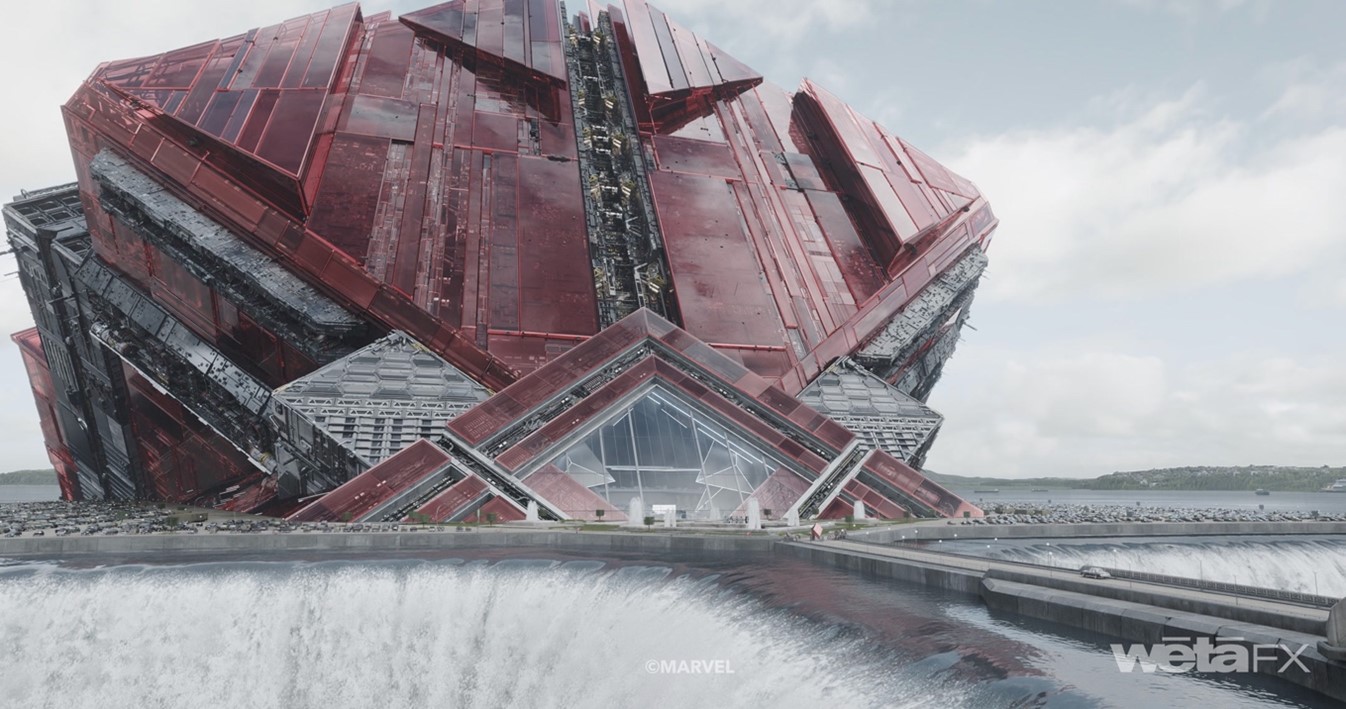
Wētā FX, recognized for their work in digital entertainment, played a crucial role in the production of “Guardians of the Galaxy Vol. 3”, especially in the creation and destruction of the Arête, a large spaceship covered in rubies. The Arête was first introduced as a towering skyscraper on Counter-Earth and became a significant visual aspect of the film. Wētā FX was in charge of most of the third act of the movie, including a complex space battle sequence composed of 18 different shots. This sequence, which featured the Arête, was a standout part of their presentation at SIGGRAPH 2023 in Los Angeles. Wētā FX was responsible for 671 shots in the film. Their contributions have been widely recognized and showcased in various industry presentations and talks. Jason Galeon from the team shared insights about the process of bringing the Arête to life and the challenges they overcame during its development.
SIGGRAPH: Walk us through how you built the largest-ever spaceship model for the Guardians series. How did this differ from previous projects?
Jason Galeon (JG): The sheer scale of the Arête created a novel challenge in itself. For context, the Arête is roughly four kilometers (2.5 miles) across — about the size of Mt. Kilimanjaro — and had to hold up from every conceivable camera angle, from a distance of hundreds of kilometers to extreme close-ups. It’s first seen as The High Evolutionary’s genetic laboratory peeking out of Counter-Earth harbor. Then in the second act, it erupted out of the earth and launched into outer space. It also was a centerpiece for the the final battle. In the process, it fractured and dramatically blew apart, revealing all the detail inside of the ship as well. Creating 64,000 cubic meters of highly detailed spaceship was not practical, so we knew we’d have to treat it more like a city than a spacecraft and utilize new procedural modeling and layout tools to accomplish it. Oh, and it’s covered entirely in ruby red glass.
We started with concept art and references of large red glass architecture around the world, like Gienke’s Great Amber Concert Hall in Latvia, and Cesar Pelli’s Pacific Design Center in Los Angeles. It’s important to anchor ourselves in reality during the design phase, especially when we’re creating something physically impossible.
As far as our design process goes, we developed narratives and stories for different regions of the spaceship to create a cohesive design philosophy. This could then be shared across artists and departments, from the art department to models to look development, to ensure that every element had the same set of clear design goals. Seamless collaboration across all disciplines was the most important element when it came to designing the Arête.
SIGGRAPGH: What obstacles did you run into during the build? How did you overcome them?
JG: One obstacle was dressing the multitude of highly detailed geometry sets along the surface and substructure of the Arête in an organic way that reflected an internal logic and design. We lovingly referred to this dressing as “greeblies” (a term coined by ILM for the amazing surface detail on the Death Star). Kenneth Johansson and his team modelled an array of beautifully crafted greeblies, and Tim Civil in our layout department developed a CityBuilder approach to their placement. Surface panels from the proxy were subdivided and given unique ID numbers, then given a random seed to govern further subdivision. A similar approach was used to cull panels and expose the greeblies underneath. The glass was then extruded to different thicknesses, weighted by the size of the panels themselves, and so on. The goal was to create what we referred to as “Octaves of Detail.” No matter how close or far away you get, the same high degree of detail exists. We then created further detail by projecting 2D silhouettes of our greeblies along the surface and used Houdini’s UDIM auto-layout tool to prevent these from overlapping and swapped them out for their 3D counterparts.
SIGGRAPH: Your team took a whole new approach to tackle a project of this size. What did this new approach look like, and why did you take this direction?
JG: The complexity and scale of the model itself created inherent complexity in the shading due to the hundreds of highly detailed unique subcomponents. To manage this massively complex build, “Guardians of The Galaxy Vol. 3” was the first Wētā FX show to use our proprietary shader system called SQUID. This enabled us to use layered instancing and nested USD layering in our shaders for the first time. SQUID only compiles co-shaders that are directly connected in the flow of the graph, rather than the entire network, meaning the shading networks are far more efficient. Artur Vill and the shaders team did a lot of look development trials using SQUID for the red glass, testing different levels of depth and complexity and varying the index of refraction between glass and ruby to get the right amount of transmission and reflection.
SIGGRAPH: What was the most surprising part of this project for you and your team?
JG: The most surprising part of this project was the emotional reaction from the audience once the film was released. We are used to working on big spectacles and blockbuster movies, but rarely do people cry and get attached to the characters. Rocket’s story arc was quite touching, and it was rewarding to see such an outpouring of emotion from the public for a superhero film. I think that speaks to James Gunn’s writing and directing prowess more than anything.
SIGGRAPH: What is your favorite scene you worked on for this installment of Guardians, and why?
JG: My favorite scene that I worked on was the card game between Kraglin, Cosmo the Space Dog, and Howard the Duck. I’m a big fan of B movies, and the 1980s movie “Howard the Duck” (produced by George Lucas!) holds a special nostalgic place in my heart. I remember seeing it in a theater and being the only one I knew who loved it. And just before “Guardians 3,” I helped create Eagly for the HBO series ”Peacemaker,” which gave me some experience creating photoreal birds and feathers. So, when the opportunity came up to have Wētā FX design and create a fully realistic Howard the Duck that would talk and perform in a dramatic scene, I leapt at it.
SIGGRAPH: What advice do you have for someone planning to take an “unusual” approach to a project like this?
JG: Use story as a design tool to help navigate complex, collaborative design. Write narratives for what you’re building, so that the entire team can share the vision and become architects themselves, rather than feeling their contribution was isolated to their discipline. Collaborating across disciplines to empower artists on your team to become co-authors of the design creates emergent properties that you didn’t think possible.
More behind-the-scenes looks at top-tier productions await you at SIGGRAPH 2024! Visit the website to stay alert of submissions deadlines as we prepare to gather in Denver, 28 July–1 August.

Jason Galeon joined Wētā FX in 2009 to work on James Cameron’s “Avatar” and has worked in a range of VFX roles on a number of high-profile projects such as “Iron Man 3,” “The Suicide Squad”, and in 2022 creating the pet bald eagle (Eagly) for the “Peacemaker” TV series. Most recently, Jason wrapped on “Guardians of the Galaxy, Vol. 3” where he served as sequence VFX supervisor. Hailing from New York, Jason started his career in architecture and took his evolving interest in 3D visualization to a career in visual effects. Jason was on the board of the Visual Effects Society in New Zealand for many years and is currently involved in TEQ TALKS — a regular talk series run in conjunction with the VES and Double Vision Brewery — short talks by fascinating creators and innovators, paired with wine and beer. To re-energize and to balance the intense VFX work, Jason runs ultra \marathons and is an illustrator in his spare time.


