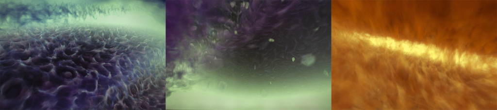
Image credit: Emil Polyak, “Homeostasis” (2019) screenshot
We value our storytellers, praising writers, directors, and poets. But, receiving no recognition or acknowledgement is perhaps the greatest storyteller of our generation: data. Emil Polyak emphasizes the importance of this powerful narrator, highlighting the human impact on climate change, in his SIGGRAPH 2020 Art Gallery selection, “Homeostasis”. We caught up with Emil to better understand his process for developing generative art, working with a multidimensional dataset, and creating interactive elements.
SIGGRAPH: Talk a bit about the process for developing your project, “Homeostasis.” What inspired you to pursue this concept in your artwork?
Emil Polyak (EP): Data and information consumption has always been a great interest of mine, especially how factual, quantitative, and scientific data today is still subjected to societal disapproval and, many times, distortion. Despite vast efforts to demystify science, the public perception of data hangs on pseudoscientific viewpoints and context, prone to political influence, that are filtered through bizarre ideologies from time to time, or simply sugarcoated to support economic expectations.
Data related to climate change is currently looked at through this prism, despite the multiple dimensions and connections, such as greenhouse gas emission and global sea level rise. In my mind, data sets are fascinating stories; every spike and every dip is a plot point beyond the numbers. Just think of the current health crisis and how it affects all aspects of our lives each day. In a hundred years, it will only be data from the distant past, and we can only hope that the public will not see it as “fake news.” “Homeostasis” was inspired by the dissonance in how the public interprets, ignores, and denies data, and how present actions reflect back on data, consequently shaping our future. Therefore, the interactive component represents our bias and also our ability to turn things around, if we want to.
SIGGRAPH: Let’s get technical. How did you develop this project? How many people were involved? How long did it take? What was the biggest challenge? Our audience loves details!
EP: I started working on elements of this project about a year ago. The initial design process involved the conceptualization of what I wanted this piece to feel like. Most artists start by sketching ideas to see what works. However, for generative art, my process is more primitive because I know that, at the end of the day, I will need to develop everything procedurally, so my thinking must start that way, too.
In an attempt to imagine something that is unreal, yet familiar, I came up with a few principles, including motion derived from rotation, structural symmetry and functional asymmetry, vertical and horizontal space, segmentation and grouping, and repetition. This process helped me to find an entry point to dive deep and actually start making things appear on the screen. The next step was to consider and test variations with texture, time, shapes, dimension and form, direction, and value. With a background in animation and coding for various interactive installations, I wanted to explore shader programming (GLSL) for this project. This involved learning an almost entirely different logic compared to typical Python scripts for example, and, since I am not a computer scientist, it also meant opening some math books on functions and other special topics. I have worked with audio signal processing in the past and have always enjoyed the idea of deconstructing acoustic waves.
SIGGRAPH: Can you elaborate on the how the animated art was developed? How about the vapor cloud?
EP: From an artistic standpoint, almost any multidimensional dataset, such as those related to climate change, can be observed similarly to how sound is seen in the time domain compared to the frequency domain. It really does not make much sense for data scientists, but in artistic expression, it forces me to stay within the objective boundaries of the data while modulating the visual variables. For this purpose, my application continuously samples the data, while it also continuously changes the scope and the way of interpretations. Basic examples would be time-slice comparison, averaging, and measuring the sharpness of a spike or a dip. These samples are variables that affect shapes, colors, transitions, camera, and light.
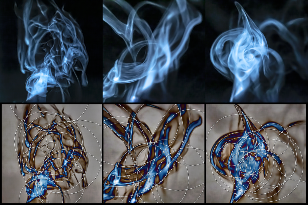
The interface is made of a moving vapor cloud that keeps projecting in the air from a small water container, while being captured by a camera and analyzed in real time inside the application. Without any interaction, the cloud movement modulates the data in its own way “naturally”. When users interact with the vapor, they affect it in ways that never happen without the interaction, and these interactions translate into bias and forceful shifts, altering the data for better or worse.
SIGGRAPH: Can you walk us through, step-by-step, development of the most challenging technical aspect of the work?
EP: The most challenging part of the work was developing the interactive component using the vapor cloud. I used a piezo-electric transducer, which is a very simple component that converts high-frequency electronic signal into high-frequency mechanical oscillation. When submerged, the water tries to keep up and follow the oscillation, but this is impossible due to mass inertia, and as the result the momentary vacuum forces extremely tiny droplets into the air. I have tested several commercially available devices, but none of them met my expectations on the visual side, so I fabricated a custom one. I have experimented with different frequencies to achieve the whispy, slow emission. I ended up with 1.72 MHz with the appropriate transducer designed for that range.
I recorded a large amount of high-resolution samples using a DSLR camera, and started analyzing them by sketching them on paper. Looking closely some reminded me of X-ray images of bones and internal organs, while others looked more like smoke. What I really liked was the twisting, ribbon-like shapes, tapering, waving, folding into circles, compressing, pinching, then spiraling back into a ribbon before disappearing entirely. These visual characteristics were directing my decisions to filter the input in ways that allowed me to train a machine-learning module to recognize and classify these changes by finding 15 circles in each frame. The position and the radius of these circles is what matters most. I am happy with the outcome, and I think it is a special area that I will be exploring more in the future with stereo vision.
SIGGRAPH: This art can really help people understand the drastic changes in sea level that our oceans have endured. What impact are you hoping to make on SIGGRAPH’s global audience? What message do you want conference participants to take away?
EP: I see artistic expression as an opportunity to tap into empathy. This interactive visual journey attempts to evoke emotions by triggering virtual flashbacks of calm ocean currents, microorganisms, large waves, and strange atmospheres, while also bringing the viewer into extensive air pollution, garbage patches, and fiery temperatures.
I think “understanding” can happen in many ways. What I am hoping is that the piece is memorable enough to generate an emotional impact and that participants will think about how they felt the next day. SIGGRAPH’s audience is an amazing community of highly motivated and talented creators, tirelessly pushing boundaries. I hope that they will find it creatively inspiring and appreciate the importance of communicating serious topics to the public using computer graphics.
SIGGRAPH: What’s next for “Homeostasis”? How do you plan to continue fostering change and action?
EP: I plan to present the project in New Mexico this Fall to a different audience, and hopefully there will be more opportunities in the future. I am currently doing research on the issue of sustainability connected to digital media and technology. Motivated by the vapor cloud, I would like to explore different interactions with natural surfaces and interfaces.
SIGGRAPH: What advice do you have for someone looking to develop this kind of a unique, eye-opening art?
EP: Try to establish a strong foundation in the beginning for what the piece needs to communicate and why; then use an iterative process to figure out how. Finally, utilize any technology, even if it seems far-fetched — the more unusual the better, because even if it fails, it will most likely generate a new idea, or it will point to a unique solution on the way. I also highly recommend writing down ideas in a sketchbook or recording them by other means, even if they are fragments or sound childish. These ideas can be later paired up and developed further.

Emil Polyak received a master’s degree in cross-disciplinary art and design from the University of New South Wales in Australia. With background in 3D animation, interactive media, and digital arts, Polyak is exploring intersections of science, engineering, and art. His work focuses on research-informed design practice with emerging and experimental creative technologies to expand disciplinary boundaries and create meaningful experiences. The overarching goal of his scholarship is to reimagine creative practice with the possibilities and implications of computational creativity. Prior to joining Drexel University, he taught at NYU, at Media Design School, and at NC State University.