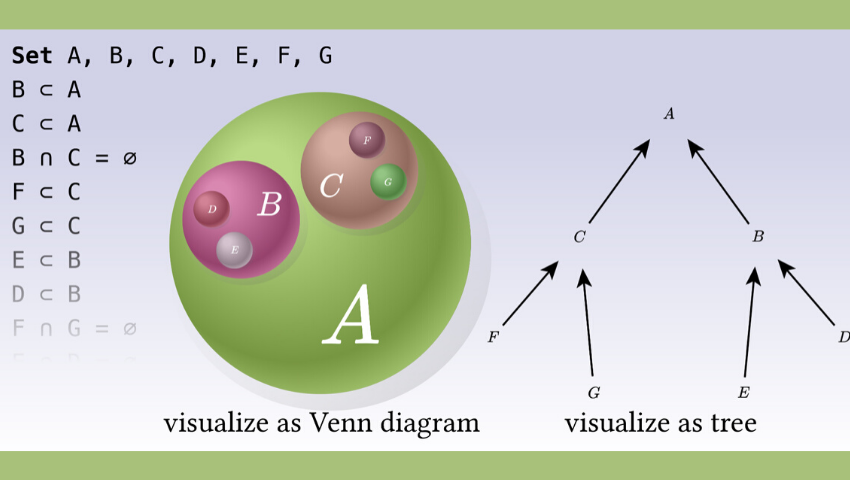
“Penrose: From Mathematical Notation to Beautiful Diagrams” © 2020 Carnegie Mellon University
Pictures, graphics, and striking visualizations have often been used to help translate a narrative and explain complex ideas. Consider how often text is accompanied with photos and artwork, or even with other visual content like brief videos or a creative GIF. While words matter, communicating via pictures also is an impactful way to get a point across.
One field where this isn’t quite as easy to achieve is mathematics. Effective communication of mathematical ideas continues to be a major challenge for students, educators, and researchers. A team of computer scientists from Carnegie Mellon University (CMU) has developed a new tool to tackle this problem.
The program, called Penrose, turns abstract mathematical expressions into pictures that can be more easily understood. The research team, led by Keenan Crane, assistant professor of computer science at CMU, and Katherine Ye, a computer science Ph.D. student at CMU, are slated to present their work at SIGGRAPH 2020. The conference, which will take place virtually this year, brings together a wide variety of professionals who approach computer graphics and interactive techniques from different perspectives and continues to serve as the industry’s premier venue for showcasing forward-thinking ideas and research.
The researchers behind Penrose set out to develop a fresh, new tool that lets users create diagrams or figures by just typing in ordinary mathematical expressions and allowing the software to do the rest. The result, say the researchers, is a framework with the ability to translate abstract ideas into beautiful and instructive illustrations — some can be produced in just a matter of minutes — that can be used to enrich teaching and scientific communication.
“As computer science researchers, we encounter this problem firsthand in having to illustrate our own work,” Ye, lead author of the research, says. “More times than not, there are only a select few individuals who have both the deep understanding of the research and the expertise with graphical tools. Our program empowers people to easily explain this complicated translation process to the computer, so that the computer does the heavy lifting for the user.”
The researchers crafted new, tailor-made programming languages that make it easy for users to say how a mathematical object, like a vector, should get translated into a visual icon, like an arrow, for example. These rules become an instant library of visual tools for the computer to use as it finds possible diagrams that are striking and also accurately convert abstract concepts into pictures. Then, the user only needs to focus on selecting and editing diagrams from a gallery of candidates.
“Our vision is to be able to dust off an old math textbook, drop it into the computer, and automatically produce a beautifully illustrated book that way more people can understand,” Crane says. “We are a long way from reaching that goal but have laid the foundations with this new tool.”
The paper, “Penrose: From Mathematical Notation to Beautiful Diagrams,” was coauthored by an interdisciplinary team of researchers from CMU. Coauthors include: Wode Ni, Max Krieger, Dor Ma’ayan, Jenna Wise, Jonathan Aldrich, and Joshua Sunshine. In future work, the team hopes to use these tools to address visualization challenges in other fields, such as law, chemistry, and biology.
SIGGRAPH 2020 is taking place virtually this year. For the latest information about the virtual experience, visit the SIGGRAPH 2020 conference page.


