© 2021 SPAI. All Rights Reserved.
Netflix and Sony Pictures Imageworks’ “The Mitchells vs. The Machines” stands among a lineup of at least three films released in 2021 that posit the perils of social media and/or the web. As one of the top SIGGRAPH 2021 Production Sessions — and with awards season on the horizon — we caught up with Sony Pictures Imageworks VFX Supervisor Mike Lasker to discuss the project, which showcases the work of approximately 600 artists.
SIGGRAPH: How did you approach animating digital concepts in this film and how was that different from the physical world that was created around the family?
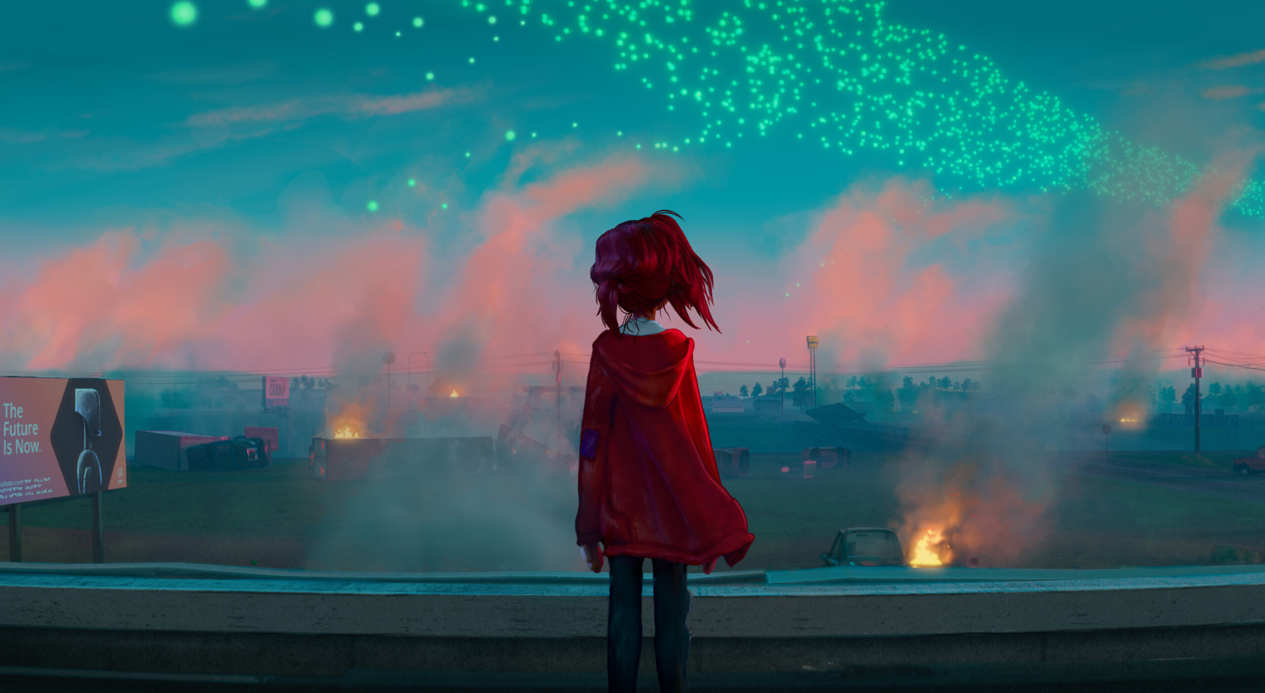
Mike Lasker (ML): The major challenge of the visual style of the movie was creating the handmade world of the Mitchells versus the computer-made Pal world. So, on the first day [Director Michael Rianda was] like, you know, this is the biggest thing to figure out: How do we have these two looks in the same movie and have our characters exist in both?
We started building the handmade looks first because there was a lot more to develop with that. It involved modeling and studying references in order to achieve a textured and painterly look for everything. Then, as we started to get into things like the Pal campus auditorium — which was still man-made but higher tech — we began to adjust to much sharper details. All of our tools and textures got cleaner, and we started using more stylized reflections. Kind of like what we did on “Spider-Verse”. The auditorium was the first “computer” environment we did, and then we slowly got more into the Robot City, Pal’s rocket, office, and everything else.
All of the tools we designed initially were [to accomplish the handmade look, but] we built in dials in order to reduce the overall effect. For example, if outlines were off the surface, we would pull them in all sorts of variations. So, we were able to keep the style of the movie uniform and just sort of clean things up [for the computerized world]. When we got into Pal’s office palette and anything related to that, we shifted all our material work so the lines were glossy, sharp, and clean. It was definitely a much different feel. We even had logo designers come on to help us with the Pal branding so that it felt like a real tech company. And, the campus was really manicured with green grass, especially compared to the Mitchells’ house, which had a really rough lawn that was disheveled.
It was a really interesting process, going from one to the other and we kind of did it chronologically. In the movie, we start with a messy world, and then [through the store] it shifts futuristic. While you’re in production and you’re developing things, you’re doing it all at the same time, and it was a fun challenge to make, for example, a character like Rick exist on the rocket and then exist in his house. The changes are subtle but noticeable.
SIGGRAPH: Fantastic. Just because we’re talking about style in different environments, I don’t know if this came from story, or if this came from your team… Whose idea was the giant Furby in the mall scene?
ML: That was definitely a Rianda idea. Our production designer had a Furby, so we used that as a reference to first build the little ones, and then built the big one. I couldn’t wait for people to see it. Even in storyboards, the sequence was nuts and showed a Godzilla-like laser beam coming out of its mouth. It’s a classic destruction moment, when it comes to the effects. We even came up with a melty effect so that, as it breaks away, you see the different surfaces glowing because they’re really hot. It was just off the charts.
SIGGRAPH: Definitely a fun fact. Between this and “Stranger Things” there’s a lot of mall nostalgia right now.
ML: I know. I grew up at malls. Our mall was supposed to resemble the Mall of America and just that quintessential, nostalgic feeling. It was that was a lot of fun [to create].
SIGGRAPH: It has been shared that a machine learning regression model was integrated into Houdini for “Spider-Man: Into the Spider-Verse” in order to predict where line strokes would be positioned in the characters (thus, helping in-between shots). Was the Ink Line Tool you presented during SIGGRAPH 2021 an upgraded version of that, or were there other, newer techniques that were used to help animate 3D lines in this film?
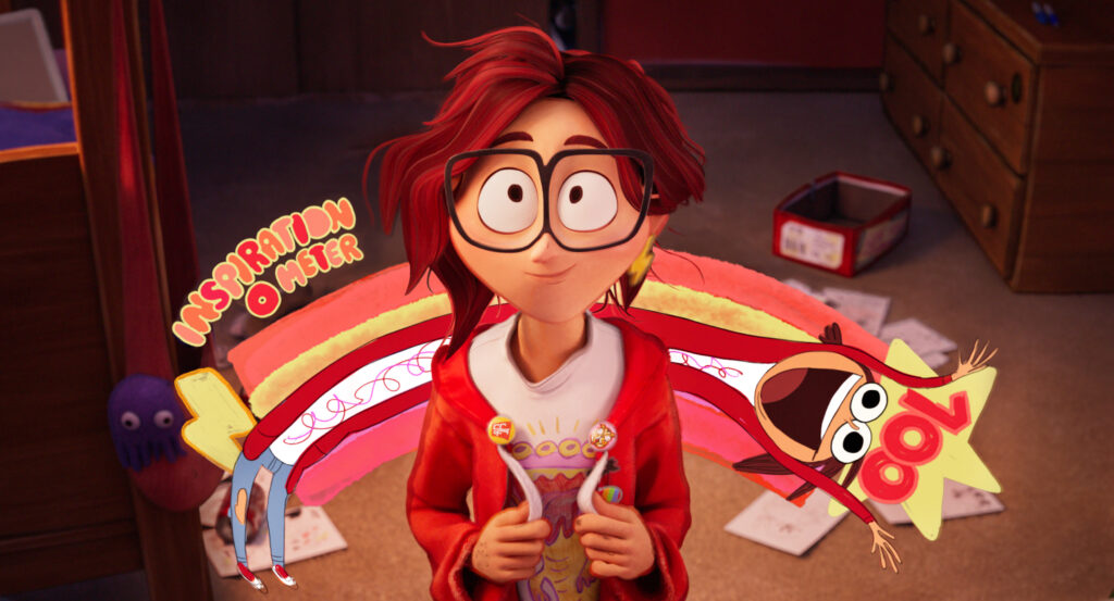
ML: So, the Ink Line Tool was an upgrade from what was used in “Spider-Verse”. “Spider-Verse” has many different ink lines going on: some of them are from animation and some of them are from effects. And the facial performance lines in “Mitchells” were the lines from animation — so all of the forehead lines, the lines in the face, those were all actually hand done by animation. The machine-learning lines that our Houdini tool would make, we did not use those in “Mitchells”. For example, those lines in “Spider-Verse” as a character turn its head — nose bridge lines, chin lines — are less performance-based and more form-based. And, in “Mitchells”, the design of the characters just didn’t have lines like that, so most of the lines in “Mitchells” were more artistic watercolor with a few of the accents in the face. We didn’t use that tool.
SIGGRAPH: Do you see machine learning becoming a central part of any specific steps in production pipelines in the future? How can creators balance tools using this “black box” to automate things, while not losing the ability to defer to artist control when needed?
ML: I feel like, at least right now, machine learning is being used for specific things. For the type of lines that we were using machine learning for, there’s still a lot of manual work to train and teach through performance. And then we’re also talking about machine learning with up-resing images — going from 2K to 4K — and adding detail. The types of projects that I like to do are so artistically based that I just [feel that] the more you have it automated, the less good it looks. I don’t really believe in having machine learning overly involved in an artistic way.
For me, it’s more like using it in smart ways that just add to [a project]. Am I saying that machine learning won’t come in and start doing more? No. But, from everything I’ve seen, it’s really [just used] in specific spots to help the process and not hurt it, and to actually really help do cool things.
SIGGRAPH: When the stealth robots (at the Pal headquarters) get sliced and then reform, is the geometry still the sliced parts or is the original unsliced geometry switched back?
ML: The bots tool is a really cool one that animation created. They can literally slice [a robot] up kind of randomly, and every shot would be different when they animated it. As an example, if a robot arm breaks, does something, then comes back and reforms, basically, [the animator] would swap it back to the original geometry. Even if [the animator] didn’t, the robots are so perfectly sliced that viewers probably couldn’t tell. But typically, they would swap it back to its original form. With every shot being different, I’m sure sometimes it’s not completely consistent.
SIGGRAPH: Can you go into more depth about the brush stroke system? Was it all artist-controlled or was there an initial pass and artists just tuned the settings?
ML: This was one of my favorite tools that we made because it really made the lighting look painterly. What we tried to do is use it with multiple types of projections, and we liked to tune it to the camera.
So, we typically set up key lighting for a sequence and get things ready in a general sense — you get the lighting rigs set up, the general settings by the key lighter, et cetera. But, every lighter on every shot would typically be tuned once they got in there. For example, if [the character of] Rick was far from camera, we might use bigger brushstrokes versus little ones for visual clarity. And we had all these different types of brushes to pick from. It was just nice.
Every artist could choose what would look good in a scene and you get this sort of inconsistent, but painterly look throughout the shots. What was really great was that it acted dynamically with the lighting. So, as a light would move over an object, you’d see the brushes sort of change. And, it just didn’t look texture mapped on, it looked really natural, and it gave the artists an opportunity to inject their taste and their artistic eye into the shots.
It wasn’t an effect that just hit you over the head, it was a subtle but ingrained effect, and lent itself to the overall painterly look. We definitely let the artists run wild and figure out what looked the best. Honestly, I always encourage artists to do what they want, you know, to use their ideas and their artistic eye. That’s what makes these projects special. I don’t like to micromanage that stuff.
SIGGRAPH: Pipeline wise, what are some of the more common tools you are using across the teams (proprietary vs. commercial)?
ML: So we use Maya, primarily, for modeling, animating, CFX (cloth and hair simulations). We use Katana for lighting, rendering, look development. Then we use Nuke for compositing, and for texture paint we use Mari and Substance Painter. We actually built Katana here back in 2005 or 2006 when we were working on “Surf’s Up”, so our lighting software was sold to The Foundry and is now used in a lot of companies but used to be proprietary. All of our shaders are built in-house with our OSL shading language, so those are proprietary but built into commonly used applications.
SIGGRAPH: In an interview with ScreenRant, you shared that the team “broke every rule in the filmmaking book” when making this movie. Tell us about the most challenging technical aspect of creating “The Mitchells vs. The Machines.”
ML: The biggest challenge was just [achieving] the look they wanted. First we had to figure out what that was. There was a lot of pre-development, where they were sort of landing on it and we would bounce back and forth. And, one of the first things I told Rianda when I started was that I’d love a painting that is as close to this look as you can get so we know what to target. It’s actually this one (points behind him; watch video below for example). This painting represented the target and we figured out the lines, the trees, the shadowing, and just all the different things that we couldn’t do yet. So the biggest technical hurdle was, number one, recreating the look of that painting. Number two was making it all move. Once you start to move things, you have a whole other set of issues that come up. And then, the third thing was writing all these tools and teaching them to the whole crew, which was hundreds of people. Those hundreds of people had to learn how to make the look, too. We typically have a core team that figures out how to do it, then a huge training department that teaches it. That’s something that isn’t talked about that much, but we need to get all of our artists to learn the tools.
As far as, you know, breaking [the rules of] how we do everything, I worked on about eight animated features before this one. You typically do things the same way. I mean, there are different looks, but for skin, eyes, hair, depth of field, lens flares, et cetera you’re typically doing things the same way in how you guide the audience’s eye. And, when you do a movie like this, you can’t rely on any of those principles. You really have to start over. Our depth of field is different, our lighting shading was different, how we did eyes, how we did hair, our hair grooms, our skin… basically, every aspect of our pipeline had to be changed. When we talk about breaking the pipeline, it’s basically like: when you’re really relying on things movie after movie and then you do one and you’re like, “Oh my gosh, the irises around the pupil have to look different, how do we do that?”, “The depth of field needs a watercolor breakup, how do we do a rack focus with that?”, every aspect has to be reexamined and reworked. It adds a ton of different things to figure out and different problems to solve.
When you do a movie like this, you can’t rely on any of those principles. You really have to start over.
SIGGRAPH: Like with “Spider-Verse”, the team on “Mitchells” really pushed the boundaries of the animation medium. How did the production timeline differ in comparison to projects that follow a more straightforward, or commonly used, pipeline?
ML: You know, it’s funny. I don’t feel like, typically, the production length has anything to do with how hard a project is going to be. [For this film,] I don’t feel like it was any longer even though we had this challenge. You have to really figure things out quickly. You have to make sure you’re making the right choices and doing things the right way. You have to fail a lot, but I don’t think that there’s really much of a difference when it comes to the production time. Whether we’re doing a “Hotel Transylvania” or a “Mitchells”, it’s more based on when the release date is and when you can get crew. There’s a time limit, but how hard it is or the challenges don’t play into it that much. But, sometimes, certain projects might get more upfront development time. As we’re doing more of these types of projects, [teams are] starting to realize that so the project I’m on now actually had a lot of development time, but usually you just have to work with the time you have.
SIGGRAPH: What scene from “Mitchells” are you most proud of? Why?
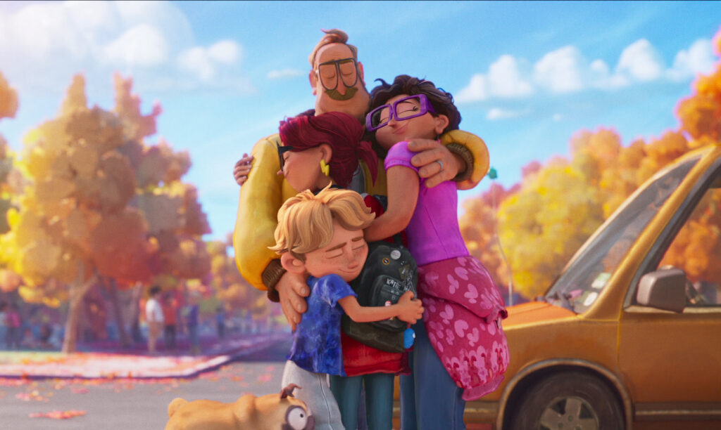
ML: When we first started developing the movie, we worked on Rick in the kitchen in their house. I feel like I grew up in that house. It’s the most handmade part of the movie. If you took our look of picture tools and stretch them to their strongest, that’s where it is. I just love the shots when Katie comes out of the house, thinks she’s gonna go fly off to college, and then there’s Rick and the family out there in the station wagon like, “We’re going on a road trip.”
The stylization of the neighborhood the grass, the houses, the trees, and the characters in the environment, the station wagon… that was the really the first time we really thought that we nailed it, and it uses every tool in our toolbox. Those shots are really like the end result of the painting. You come outside and there it is. I just love those shots more than anything. It was the culmination of months and months and months of work. Once we did that, we knew were golden to move on.

SIGGRAPH: What do you hope that your peers in the industry take away from watching “Mitchells”?
ML: I started in this industry as an artist. All I ever wanted to do is just create things that people never saw before. I love doing movies with these artistic styles that kind of do things differently. And, audiences respond. Honestly, when we did the look of this film, a lot of it’s subtle and I was always thinking, “Is the audience going to notice this, or am I just going to notice because I’m doing it every day?” They notice everything. Every little thing that you wish they would see, they do.
I think that taking creative chances, doing things differently, breaking the mold, and just taking a shot pays off. Audiences out there are starting to really love different styles, different looks, and it’s so rewarding because it’s so artistic. Being I’m artist first, I just connect with it. So that’s what I’d say. We’re at a time in animation where people want you to take chances. When CG animated movies first started, that was like the hot, shiny new penny. I think now audiences are ready to tweak it and change it, down to the soul of it.
SIGGRAPH: What is your fondest SIGGRAPH memory?
ML: I graduated in 1998 from school, and the industry was still kind of new. “Jurassic Park” came out like four years before that, and the industry was still somewhat small. So I went to SIGGRAPH in 1998 in Orlando, and it was just the most mind-blowing experience. I was, like, 21/22 and the Orlando convention center was massive. SIGGRAPH was huge and I went to go look for a job. I get there and had never seen anything like it. The conferences, the kiosks the Job Fair, it was this explosion of the industry around me. The specifics of it I remember less, but I recall walking around, going to all of these booths, and just being thrilled by the variety of stuff. All the companies I wanted to work for were there, and then standing in Job Fair lines with tons of other kids out of school all showing their portfolios. It was just an experience that I’ll never forget. When you’re young, you really remember those quintessential memories in your career.
We’re at a time in animation where people want you to take chances.

SIGGRAPH: Any final thoughts you’d like to share?
ML: We were blown away by how well “The Mitchells vs. The Machines” was received. I think we still can’t believe it. For me, what made the movie so great was the team. We were so tight — me; Mike and Jeff, the directors; Lindsay, the production designer; Alan, Nikki, our head of look — we all just love the work and we’ve done so many of these talks together and I kind of miss them. You work with these people for, like, two years out of your life, every day, and then you’re gone and go to a different project. I just think the love from crew can be seen in the work, everyone just really loved the project. It was very unique, there aren’t that many projects where you can go and make a new style that doesn’t rely on anything.
Submissions for SIGGRAPH 2022 Production Sessions are being accepted now through 22 February 2022. Join us virtually and in Vancouver to share your work!
Mike Lasker is a VFX supervisor at Sony Pictures Imageworks with over two decades of experience working on live-action and animated features. His recent credits include “The Mitchells vs. The Machines,” from director Mike Rianda and producers Phil Lord and Christopher Miller and the Academy Award®-winning “Spider-Man: Into the Spider-Verse.” Lasker is currently working on the much-anticipated sequel to “Spider-Verse,” coming to theaters in October 2022. Valuing teamwork and collaboration, Lasker previously served as a computer graphics supervisor on: “Smurfs: The Lost Village,” “Cloudy With a Chance of Meatballs,” and “Hotel Transylvania.” He began his computer graphics career in New York City working on commercials for leading advertising agencies. Lasker received a BFA in computer graphics from Syracuse University.


