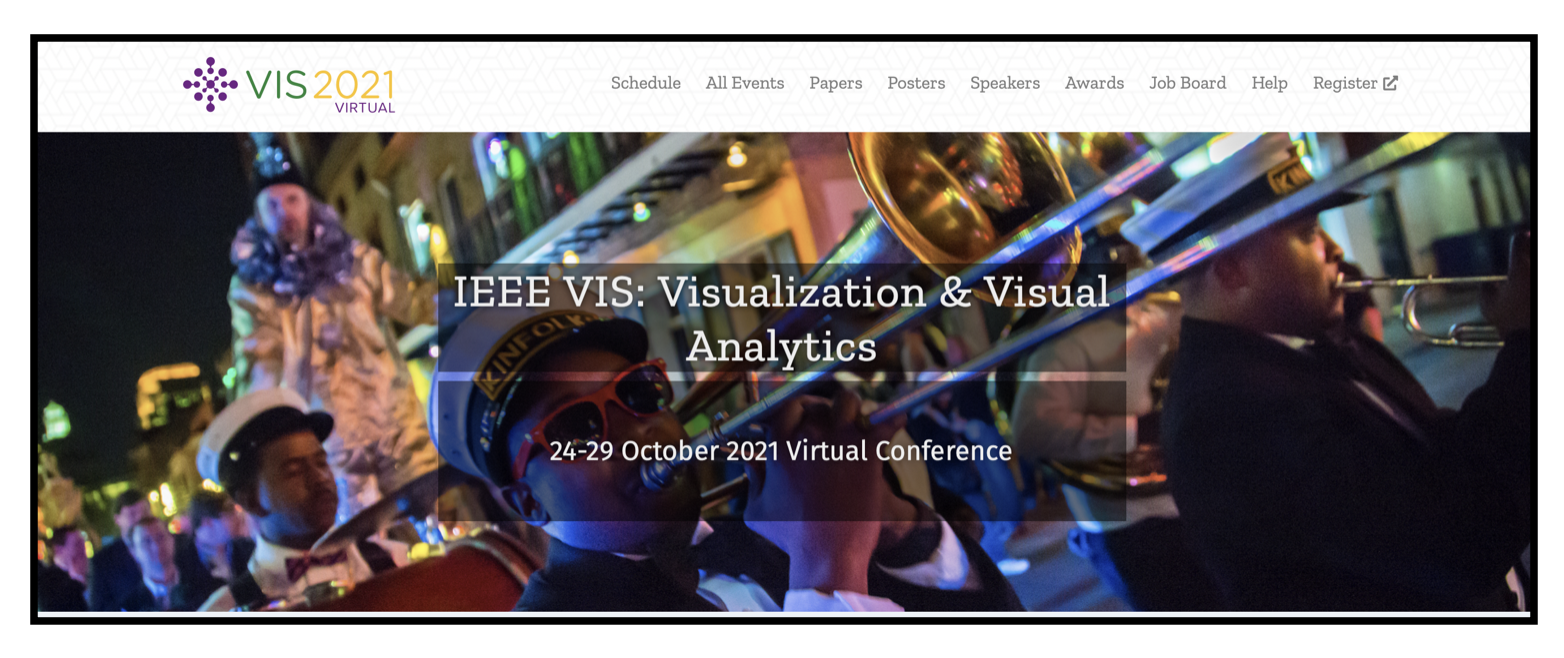
Opening image from the IEEE VIS 2021 virtual website.
The IEEE VIS conference is the premier forum for advances in theory, methods, and applications related to the transformation of data into visual representations, and takes place each autumn. This year, due to continued COVID-19 precautions, the IEEE VIS 2021 was held virtually. As a result of changes in the pricing model, attendance was free for students, $25 for members, and $40 for non-members, and there were content fees for specific published works from contributors. The virtual event was highly successful, according to reports from Conference Chairs Brian Summa and Luis Gustavo Nonato, and had approximately 3,719 attendees with 2,502 first-time attendees (compared to prior in-person events hosting around 1,250 attendees).
In this writing, we provide some background about and a brief snapshot of this leading visualization event.
Some History on Computer-generated Visualization
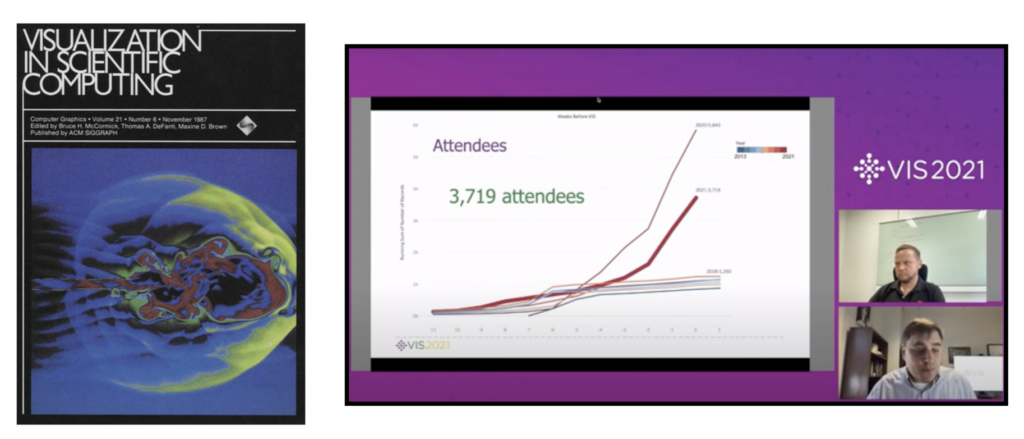
Over 30 years ago, in 1987, ACM SIGGRAPH published a landmark report on the subject of computer-generated visualization, entitled “Visualization in Scientific Computing,” in which the National Science Foundation (NSF) Panel on Graphics, Image Processing and Workstations outlined a vision for developing computer-generated visualization as a scientific field. The first IEEE VIS conference was held in 1990. Since then, visualization has become an indispensable tool, covering three major sub-areas: scientific visualization (SciVis), information visualization (InfoVis), and visual analytics (VAST). It also includes numerous domain-specific areas, such as biological data visualization, geo-information visualization, and software visualization. IEEE VIS 2021 marks the first year where the subfields and numerous domain areas were combined into a cohesive umbrella for visualization contributions entitled “IEEE VIS: Visualization and Visual Analytics”.
During its opening session, IEEE VIS reflected on research contributions with its Test of Time Awards and honored the current year’s Best Paper Awards. The 2021 Career, Technical Achievement and Service Awards from the IEEE Technical Committee on Visualization and Graphics were also announced.
Contests, Symposium, Tutorials, and Workshops

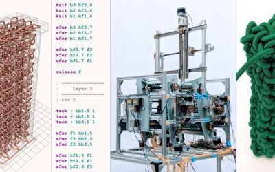
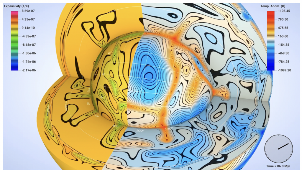
Like the annual SIGGRAPH and SIGGRAPH Asia conferences, IEEE VIS includes contests, symposia, tutorials, workshops,and anarts program(known as VISAP) held during the week. Selecting “Events & Community” from the IEEE VIS 2021 website expands a list of some of the activities held during the virtual event. Choosing “Program” opens links to the papers, posters, tutorials, workshops, panels, and application spotlights that were selected or curated for presentation. Below we show an image from the 2021 SciVis Contest’s First Place Award. The 2021 SciVis Contest theme was “Earth’s Mantle Convection”.
The Keynote: danah boyd “In the Pursuit of Knowledge, There Be Dragons”
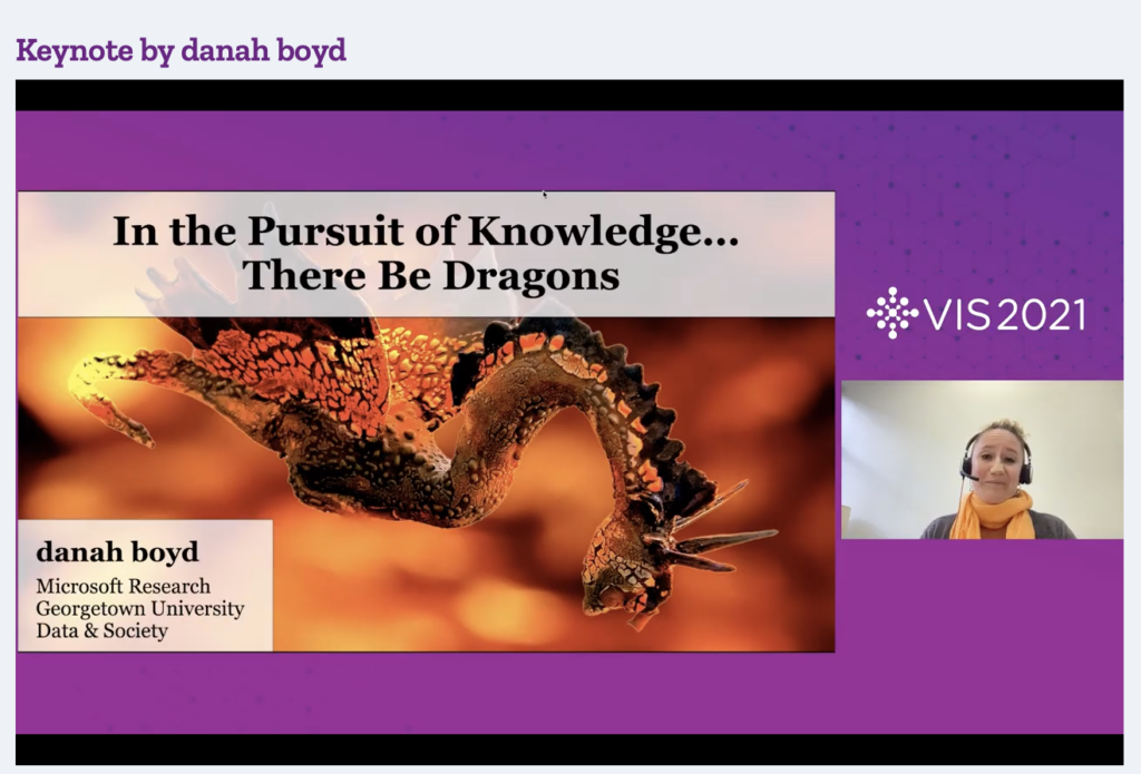
danah boyd, an internationally recognized authority on the ways people use networked social media as a context for social interaction, gave the virtual keynote for the conference. She is a partner researcher at Microsoft Research, a visiting distinguished professor at Georgetown University, and the founder of Data & Society. As she noted at the start of her talk, she began her career in visualization and was thrilled to have a “homecoming” to highlight her thoughts on the challenges of uncertainty and ignorance in visualization.
She noted that a visualizer of data makes choices in producing the final presentation of the given data that shapes how those data are perceived. There is no neutral visualization, just as there is no neutral data. boyd also highlighted the “illusion of precision” by focusing on the algorithm for automatic apportionment of Census data in the U.S. The talk concluded with the following message: “My ask of you today is simple: Pay attention to the limits and biases of your data and the ramifications of your choices. Put another way, there be dragons everywhere. Design with care and intention, humility and flexibility.”
danah boyd has since posted the text of her IEEE VIS 2021 Keynote, “In the Pursuit of Knowledge, There Be Dragons”, for you and others to review and enjoy.
The Capstone: Fernanda Viégas and Martin Wattenberg “When Experience Fails: Things That Work When They Shouldn’t”
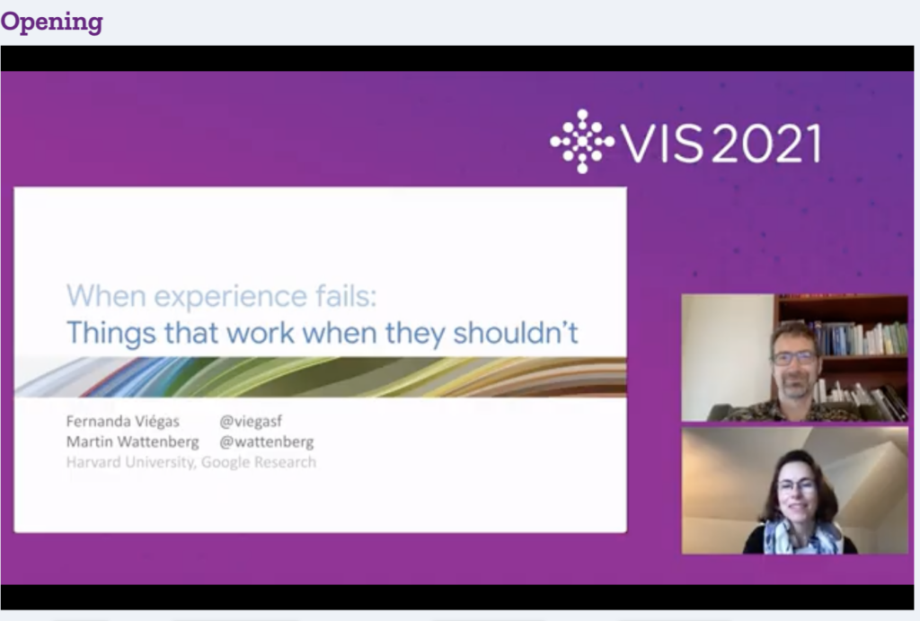
Fernanda Viégas and Martin Wattenberg, principal scientists at Google and Gordon McKay Professors of Computer Science at Harvard, presented a lively and informative Capstone session on “When Experience Fails: Things That Work When They Shouldn’t”. They highlighted seven case studies from their own and others’ practice of visualization that turned out to work even though logic and theory might not have supported the success of the results. These were called “happy surprises.” Examples included “Wordle”, “Flickr Flow”, “Chromogram”, “Phrase Net”, “Rainbow Color Scales – When Life Gives You Rainbows”, and their “Wind Map” visualization.
Fernanda Viégas and Martin Wattenberg ended their presentation with an inspiring comment from one of their users regarding the impact visualizations have: “They look like art and make you think twice, then all of a sudden you are reading, thinking, feeling good, and learning”. This was an insightful way to end the terrific IEEE VIS 2021 week.
Noteworthy Highlights
To provide the IEEE VIS community with a taste of the SIGGRAPH conference, IEEE VIS 2021 featured a session on “VIS SIGGRAPH Presentations: SIGGRAPH Invited Talks”. Topics included “Tracing Versus Freehand for Evaluating Computer-generated Drawings”, “A Non-exponential Transmittance Model for Volumetric Scene Representations”, “Editable Free-viewpoint Video using a Layered Neural Representation”, “Pareto Gamuts: exploring optimal designs across varying contexts”, and “NeuMIP: Multi-Resolution Neural Materials”. Each of these papers were previously presented at SIGGRAPH 2021 and can be found in the ACM DIgital Library.
During the full paper sessions of the VIS conference, many outstanding papers caught our attention. In addition to the best papers session, we briefly mention a few presentations that deserve a second look.
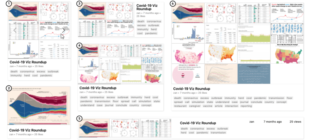
In the Interaction session, Michael Oppermann presented “VizSnippets: Compressing Visualization Bundles into Representative Previews for Browsing Visualization Collections”. These bundles package textual and visual information to allow the browsing and identification of relevant content. The authors propose the first systematic approach to visualize snippet design by maximizing information density with multiple images and for selected keywords. Pre-print, preview and presentation videos, and more are available here.
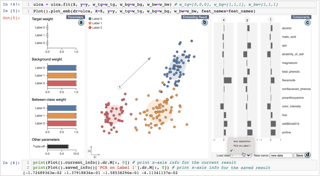
Also in the Interaction session, “Interactive Dimensionality Reduction for Comparative Analysis” was presented by Takanori Fujiwara. It helps support various comparative analysis tasks by providing a new dimensionality reduction algorithm, i.e., the Unified Linear Comparative Analysis (ULCA). The proposed work unifies two dimensionality reduction schemes and provides an interactive visual interface. Its usefulness is demonstrated using multiple case studies. For more details, please refer to the paper and the presentation.
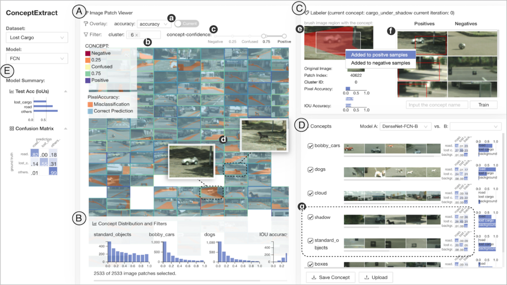
In the Explainable AI and Machine Learning paper session, “Human-in-the-loop Extraction of Interpretable Concepts in Deep Learning Models” was presented by Zhenge Zhao. The presented work supports the interpretation of deep neural networks (DNNs). It provides a global interpretation of model predictions by analyzing how visual concepts affect model decision (e.g., how shadow affects object detection), and generates user-defined concepts for model interpretation and diagnosis by addressing the challenging task of identifying user-friendly visual concepts that affect model decisions. For more details, please refer to the paper and the presentation.
In the Surfaces and Volumes session, two papers caught our attention: one addressed real-time denoising of volumetric path tracing for volumetric data, while the other investigated the inference of an importance map to support sampling and reconstruction for volumetric visualization.
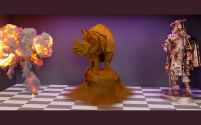
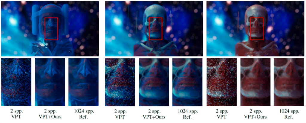
Jose A. Iglesias-Guitian presented “Real-time Denoising of Volumetric Path Tracing for Direct Volume Rendering”. He addressed the task of improving image-based denoisers by exploiting temporal coherence between frames and without taking into account the common assumptions considered for surface models. The proposed methodology preserves high-frequency details, as seen in the image below. This work improves the visual fidelity and temporal stability of volumetric path tracing during classical direct volume rendering operations, such as camera movements, light source modifications, and volume transfer function changes. For more details, check out the paper and be sure to check the presentation.
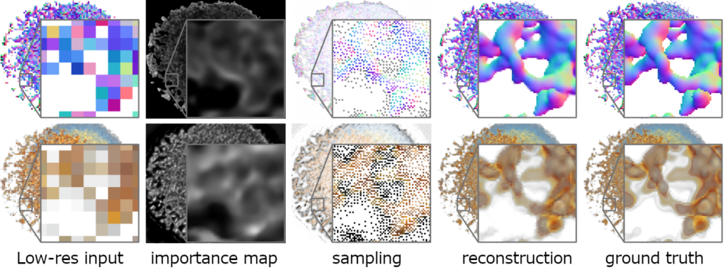
And, Sebastian Weiss presented “Learning Adaptive Sampling and Reconstruction for Volume Visualization”. This work addresses the interesting problem of whether an artificial neural network can predict where to sample the data with higher or lower density, by learning the correspondences between the data, the sampling patterns, and the generated images. The authors introduce differentiable sampling and reconstruction steps by leveraging supervised loss-based backpropagation only on the final image. In the context of creating a high-resolution image from a given low-resolution input image, they showed that the selection of relevant structures for the final visual representation can be learned in conjunction with the reconstruction of that representation. For more on this work and to learn more on the used network’s architecture, refer to the paper or the presentation.
In the Recommendation and Automation session, Li et al. presented “KG4Vis: A Knowledge Graph-Based Approach for Visualization Recommendation”. Visualization recommendation and automatic visualizations can lower the barrier for general users to create better and more effective data visualizations. Without specifying the explicit visualization rules, the authors developed a knowledge graph-based approach. The authors utilize the embeddings of both entities and relations in the knowledge graph of existing dataset-visualization pairs to generate visualization rules and achieve explainable visualization recommendation. To learn more about this work, do check out the paper and the presentation.

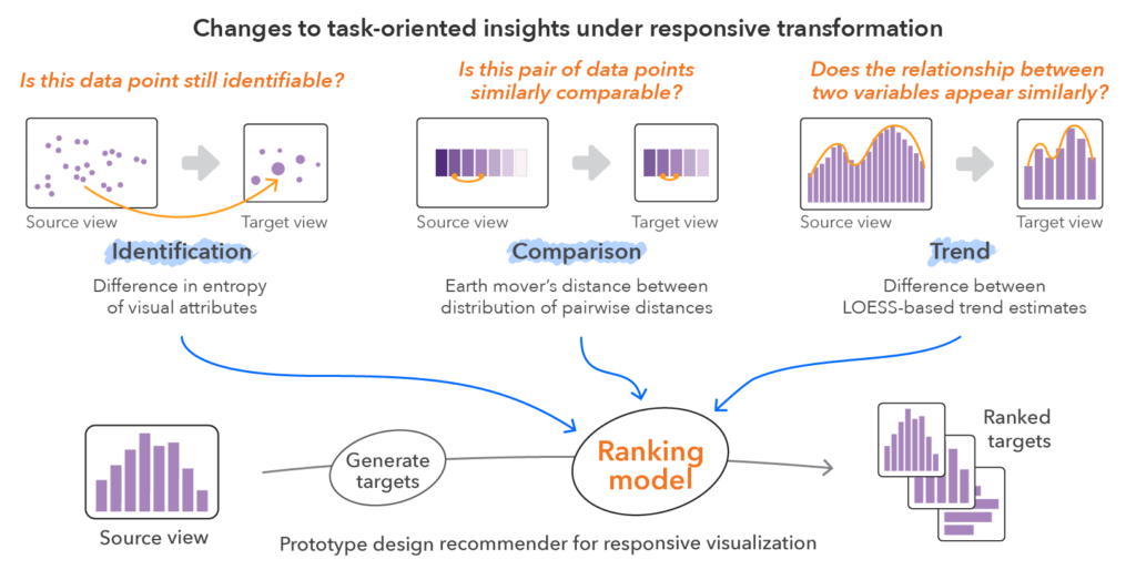
In the Immersive Environments, Personal Vis, and Dashboards session, Hyeok Kim presented “An Automated Approach to Reasoning About Task-Oriented Insights in Responsive Visualization”. Moving from large screens to smaller and portable displays can change relationships or patterns that are included in the large screen view. The authors propose an automated approach to approximate the loss of support for identification, comparison, and trending operations. Using the random forest classifier, this work achieves 84% accuracy in classifying visualizations. An important work with implications for fully or semi-automatic responsive visualization recommendation systems. Please refer to the paper and the presentation.
Many other sessions are worth a detour. We especially recommend the sessions “Mitigating Bias” and “Scalability and Rendering” to the SIGGRAPH community. Moreover, many inspiring and interesting workshops took place. For instance, the Workshop on Visualization for AI Explainability, or VISxAI, included 12 presentations plus a keynote from David Ha of Google Brain.
Ha’s talk was entitled ”Using the Webpage as the Main Medium for Communicating Research Ideas” and emphasized the need to move beyond the paper format used for scientific communication. It is expected that machine learning (ML) models will eventually be used by people in devices, computers, and other applications. Ha advocated for client-side interactive JavaScript web demos.
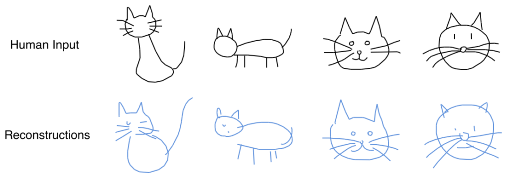
Seeing the algorithm work brings intuitiveness and understanding of the model bias directly to the user. The other advantage is that it makes these models reproducible and portable. To support the transition from static research documents to interactive web pages, he showcased many examples. Although time-consuming, he argues that creating such demos should be a labor of love. They will survive the test of time and will likely reach 1,000-times the audience compared to a typical publication.
Future Directions: IEEE VIS 2022
IEEE VIS 2022 is slated to be held in Oklahoma City, Oklahoma next year. David Ebert, Danielle Szafir, and Hendrik Strobelt will serve as co-chairs of the conference, and planning is already underway for a hybrid in-person/virtual event.
Concluding Remarks
This particular snapshot view of IEEE VIS 2021 has reflected our perspective on the weeklong premier event in the field of visualization. Like SIGGRAPH or SIGGRAPH Asia, IEEE VIS is a complex event with many sessions and activities scheduled simultaneously. We thoroughly enjoyed this year’s 2021 event and plan to attend other IEEE VIS conferences in the future.
Want to learn more about IEEE VIS 2020? Check out our 2020 snapshot.
