“Cinematic Scientific Visualization: The Art of Communicating Science” © 2019 California Academy of Sciences, NASA Scientific Visualization Studio, National Center for Supercomputing Applications, University of Illinois at Urbana-Champaign
When it comes to defining scientific visualization — or “scivis” to insiders — it “depends on who you ask.” During the SIGGRAPH 2019 Course “Cinematic Scientific Visualization: The Art of Communicating Science,” attendees who are familiar with or new to scientific visualization are invited to take a deep dive into the techniques and challenges of the scivis field with this panel of experts. We had the chance to talk with Kalina Borkiewicz (National Center for Supercomputing Applications, University of Illinois at Urbana-Champaign), Helen-Nicole “Eleni” Kostis (USRA/GESTAR, NASA, Scientific Visualization Studio), and Greg Shirah (NASA, Scientific Visualization Studio) ahead of the session to hear their thoughts on why it is crucial to effectively and clearly communicate science now more than ever, how content based on real data takes on a whole new meaning for audiences, and the goal of making work more artful so that it is shared and consumed among the greater population. Read on to learn how scivis takes data to the next level!
SIGGRAPH: Let’s start with the basics. For readers who might be stumbling upon this without much background, what is cinematic scientific visualization and why is it used?
Kalina Borkiewicz (KB): There are different types of scientific visualization that are used for different purposes and different audiences.
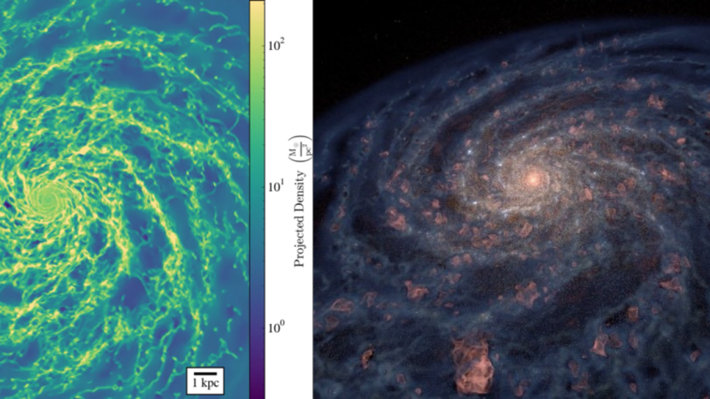
Traditional scientific visualization is most often used by scientists to analyze their data — to make sure they don’t have bugs, to find interesting areas, or to share results with other scientists in presentations or academic journals. This kind of visualization can look like gobbledygook to the untrained eye, and the graphics tend to use rudimentary techniques, like 2D slices through 3D data and rainbow colormaps.
Cinematic scientific visualization is the presentation of real scientific data in a way that is understandable and aesthetically pleasing to mass audiences who may or may not have any scientific background. This type of visualization has more of a focus on art, design, and filmmaking techniques (camera choreography, lighting, coloring, shading, compositing, etc.). The purpose of cinematic visualization generally isn’t scientific analysis but rather communication with the general public through films, TV, museum exhibits, and the like.
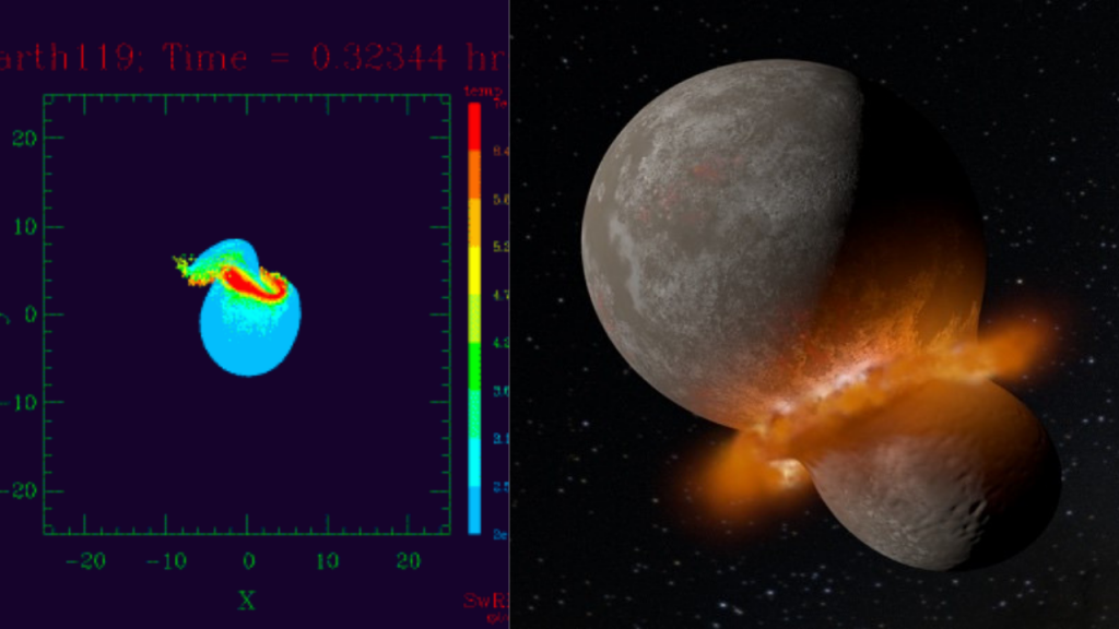
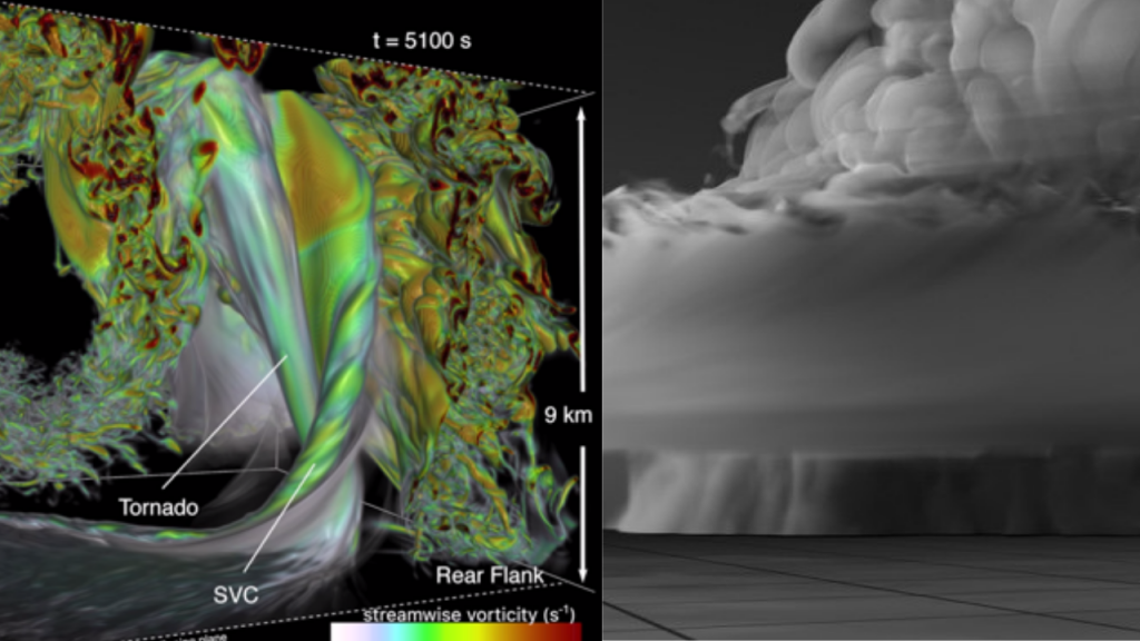
Here are some examples of the same dataset visualized traditionally versus cinematically:
Helen-Nicole “Eleni” Kostis (EK): Cinematic scientific visualization is the field of production-quality, computer-animated storytelling that is solely based on real data. The impact of these movies stems from creating visual representations of — most often — spatial data with an inherent structure that is invisible to the naked eye. Such movies allow us to perceive data, and therefore science, in otherwise impossible scales and perspectives. Thanks to such productions, we can “see” satellite orbits, solar flares, climate phenomena, and even processes at the molecular level. It is definitely a distinct practice within the communities of computer graphics and production. I see these movies as celebrations of scientific integrity and engineering research.
It is used to inform, engage, and educate the public about scientific discoveries and phenomena. Within NASA, cinematic scientific visualizations have broad use: they are used by scientists in their outbound communication, like conferences, interviews, and news media. Then, since our products are freely available to the public, they take a life of their own thanks to museums, filmmakers, documentarians, educators, and news outlets. I should point out that even though it is a niche field, it has a rich history of almost 50 years in the making!
Greg Shirah (GS): I think that, like many things, the answer depends on who you ask. In my world, cinematic scientific visualization is high-quality computer animation that is driven by scientific data and tells a scientific story. By high quality, I mean something that can be shown in theaters or on television — typically at least 1080 pixels resolution, but often 4K or higher resolution with carefully chosen camera paths and, sometimes, motion-blurred output.
The science stories that I’m involved in telling are for NASA public outreach and are often driven by scientific discoveries. The science data tends to be either observed data (e.g., from a spacecraft) or computationally modelled data (e.g., from a climate model). Nearly every aspect of our visualizations is driven by data. Real data has a complexity that, when combined with high-quality rendering, allows the visualizations to have an impact comparable to reality. This is particularly true when the visualization represents the data as real objects in real locations, such as a depiction of data from a hurricane that is depicted in the correct location on the globe with the right cloud patterns, etc. We strive for all of our visualizations to be cinematic, but depending on funding levels and delivery schedules, some are more so than others.
Cinematic visualizations also tend to be made using visual effects software (Maya, Houdini, Renderman, Mantra, Mental Ray, etc.) as opposed to niche visualization software (e.g., Geographic Information Systems (GIS), orbit software, medical software, etc.). There are pros and cons to using visuals effects software for this purpose, but the primary advantages include:
- Excellent keyframe/animation/camera controls
- High-quality output with motion-blur
- Robustness
- Parallelizable for fast rendering on render farms
- Extensible (e.g., animation scripts, shading languages)
SIGGRAPH: In your opinion, what makes effective science communication more important now than ever before?
KB: We are in an era of misinformation and “fake news.” Many people mistrust science and scientists, and we can see this with the rise of things like the anti-vax movement, climate change denial, and the Flat Earth Society. Science communication is our strongest weapon against this, and cinematic visualization is one angle we can take. It is important to be able to explain scientific concepts to people in a way that is approachable and that they can understand. Doing so with images can be useful because seeing how something works builds intuition about it. It is one thing to learn that plants use photosynthesis to capture photons of light and produce ATP, but watching the process occur in front of your very eyes is actually quite exciting in a way that facts and vocabulary words are not. Seeing is believing!
EK: It is true that we are experiencing an outburst in the generation of digital content across a multitude of distribution platforms and social media outlets. We are also seeing a proliferation of DIY tools for digital media production and visualization. Yet, despite this fertile environment, there are open challenges for the field. The primary one is to find people where they are, which means to actually package and carry the content and messages over to the different digital platforms they are using. An equally critical challenge is educating audiences about the importance of data integrity and provenance and that is where finding and identifying trusted sources becomes really important.
GS: Science is our best way to learn about the universe. Using science, we are able to arrive at objective, verifiable observations that become facts. Effective science communication of these facts is crucial in today’s world of social media, where it is so easy to spread false information. Visualizations of important global issues like climate change can influence the general public as well as policy makers.
In my experience, visualizations based on observed satellite data in particular are powerful persuasion tools. I have found that people tend to trust a visualization more when they hear that it is based on observed data, as opposed to one based only on modeled data. This is particularly true when the visualization involves changes on Earth. When a visualization of observed data agrees with a visualization of modeled data, people tend to have more trust in the model.
Scientific communication is very important to NASA, so much so that we have a mandate to do it. One of NASA’s top-level strategic goals is to “Inspire and Engage the Public in Aeronautics, Space, and Science.” We do this by sharing NASA science and mission results with the public in a way that is — hopefully — understandable.
SIGGRAPH: Discuss the partnership between art and data science. What makes developing production-quality graphics necessary in order to properly communicate science?
KB: The average person is unlikely to read an academically rigorous, scientific paper [that is] full of dry jargon and data tables. They are much more likely to watch a documentary or a YouTube video with eye-catching graphics that amaze and inspire them. Cinematic scientific visualization is a way of taking cutting-edge science and sharing it with the public so that they are interested in consuming it.
EK: Developing production-quality scientific visualizations can serve as a catalyst in conveying complex research results and in engaging new audiences in the sciences. In our practice, we harness the power of art to develop visually-rich journeys of data that invoke our senses. Personally, I prefer not to talk about a partnership between art and data science. Our practice requires seamless integration of multiple fields, including computer graphics, data visualization, art, and domain sciences, which are typically covered by subject-matter experts like our collaborating scientists and clients.
Over the last 10 years, I had the opportunity to interface with the public during NASA events, such as Earth Day, and I even spearheaded the development of conduits to distribute cinematic scientific visualizations to the public. With these experiences in hand, I can say that when we take a moment to explain to our audiences that the content they are seeing is based on real data, the content takes a whole new meaning in their eyes.
GS: Scientific data has inherent beauty; whether it is data of a hurricane, a Martian volcano, or black hole collision, datasets are often beautiful the first time you visualize them. Our job as visualizers is to build on the inherent beauty by adding context, determining what techniques to use to show the data, creating camera angles, determining appropriate colormaps, and more. All of these aspects are used to build a story — an accurate story that continues to educate and inform upon repeated viewings.
Production-quality graphics are necessary because, in any visual medium, there is a competition for viewers. Whether it is on the web, television, or in movies, media that has a “wow factor” will likely get more attention. The more artful we can make our work, the more likely it will be viewed and shared. The more it is viewed, the more people are informed about the science [behind it].
SIGGRAPH: How can SIGGRAPH 2019 attendees benefit from attending your course? What do you want them to take away from it?
KB: People who are already interested in scientific visualization can learn about techniques that are used by the NCSA, NASA SVS, and California Academy of Sciences, as well as hear about open challenges and what cutting-edge work is being done elsewhere around the world. We will cover a breadth of topics not only limited to the “how-to” of visualization, but also things like storytelling with data, education, human perception, color theory, ethics, and visualization critique.
People who are not yet doing scivis perhaps have even more to gain… because they should be doing it! One of the goals of computer graphics has always been to represent the physical world as accurately as possible. With modern advances in technology, we are now getting closer and closer to achieving this goal. What is more realistic and accurate than real scientific data? Filmmakers are beginning to incorporate scientific models into their work, my favorite example being the movie “Interstellar,” which had a world-renowned astrophysicist developing the look of the black hole. They actually published a paper in a scientific journal about it! I expect to see more of this in mainstream film going forward. This is an excellent opportunity for beginners to start their own scientific visualization journey!
EK: The course has been developed to serve the SIGGRAPH community and conference attendees. I tip my hat off to my course co-authors from NCSA, the California Academy of Sciences, and NASA for their excellent work.
The course material is designed to reach conference attendees in different ways. If they have a similar background or are simply interested in our practice, they will discover and learn something new. For example, students will have the opportunity to learn about our practice, what skills they need to learn or sharpen, and get a glimpse of the tools we use. The production community will probably be surprised to learn that our visuals are data-driven and could benefit from hearing about our pipelines and how we work, and researchers can stick around to get a glimpse of our challenges and open problems. To science lovers and geeks, I want to say: “Come and join us in this course for a journey of visual wonder and scientific knowledge.”
On my end, I am particularly excited to share with SIGGRAPH attendees the brave efforts by exemplary colleagues in our field, present the state of the art in cinematic scientific visualization, share reflections on open problems, and talk about the impact of our work. We need to be developing programs and platforms within SIGGRAPH that showcase work with societal impact.
GS: Hopefully, this course will be interesting to all SIGGRAPH attendees. There are similarities and differences in the ways that a cinematic visualization shop works compared to a VFX shop. Both use computer graphics to tell stories. Both use similar animation and rendering software, languages (OSL, MEL, Python, etc.), compositing software, render farms, etc. However, visualization teams tend to be much smaller than VFX teams, and that requires the team members to have broader responsibilities. A visualizer typically writes shaders, scripts, animates, and composites; whereas in a VFX shop, there are entire departments for each of these. Schedules tend to be tighter with visualization — months as opposed to years.
Visualization uses computer graphics to communicate and educate instead of entertain. So, I think the takeaway is that SIGGRAPH attendees should be interested in science visualization and at least be aware of some of the fundamentals. As I touched on, science communication is critical in today’s world of misinformation.
SIGGRAPH: Have you attended a SIGGRAPH conference before? If yes, share your favorite memory. If no, share what you are most looking forward to experiencing.
KB: My first SIGGRAPH was in Vancouver in 2014. I’m really excited for this upcoming conference because it seems to really be putting more of an emphasis on scientific visualization! In addition to presenting this course, the director of the team I am part of, the Advanced Visualization Lab, is being awarded a lifetime achievement award; our visualization of a photosynthetic organelle is being shown in the Electronic Theater; one of my students is presenting a Poster on real-time scientific visualization in Unity; and we are involved in a diversity panel and several Birds of a Feather sessions. This is going to be a great year!
EK: Yes, I have been attending SIGGRAPH for over a decade. My favorite was the first time I attended virtually in 2005 and presented the collaborative telematic performance titled “Loose Minds in a Box” as part of Emerging Technologies. I have many great memories from being an active volunteer of SIGGRAPH — an immensely rewarding and learning experience, and I love reuniting with the SIGGRAPH tribe every year.
GS: This year will be my 25th SIGGRAPH conference. My first was 1994 in Orlando. My favorite SIGGRAPH experience was when Pixar showed early footage from “Toy Story” (the Army men) that blew everyone away; my favorite paper was Karl Sims’ paper and animations on “Evolving Virtual Creatures;” and, my favorite SIGGRAPH reception was at the Space Shuttle Endeavour — the reception on the USS Midway aircraft carrier was a close second.
The SIGGRAPH 2019 Courses are open to all Full Conference Platinum and Full Conference registrants. Take a look at all of the Courses offered at the conference. There is still time to register to join SIGGRAPH 2019 in Los Angeles, 28 July–1 August.
 Kalina Borkiewicz is a visualization programmer for the Advanced Visualization Lab at the National Center for Supercomputing Applications. Her primary work involves writing software that processes and visualizes various types of massive scientific data simulated or processed on supercomputers. Her most recent work makes scientific visualization tools freely available to artists and scientists, through Ytini — an open-source middleware between the scientific analysis and visualization Python package, yt, and the visual effects software, Houdini. Kalina contributed to the creation of such films as “A Beautiful Planet” (IMAX), “Solar Superstorms” (fulldome), and “Seeing the Beginning of Time” (4K). She recently gave a talk at TEDxUIUC, a local chapter of the TED conference, describing her path as a woman engineer. Aside from working on films and computer graphics research, Kalina also professionally develops Android apps and websites. She is an amateur Beatles historian, makeup artist, musician, and UI/UX designer.
 Helen-Nicole “Eleni” Kostis is a senior science visualizer at NASA Goddard Space Flight Center and currently serves on the Scientific Organizing Committee of USRA’s Earth from Space Institute (EfSI). During the last decade, she has been exploring the field of data-driven visualization as a storytelling medium to communicate NASA’s research findings to the general public and to engage new audiences. In 2010, she led and brought to life the NASA Visualization Explorer, the first of its kind of storytelling conduit that released bi-weekly data-driven visualized scientific results. She holds a degree in mathematics from the University of Ioannina (Greece), a master’s in computer science, and an MFA in electronic visualization from the University of Illinois at Chicago (USA). During her graduate years (2001–2007), she developed tele-immersive experiences, utilizing ultra-high-speed networks, and virtual reality systems that were exhibited internationally at conferences and festivals such as WIRED NextFest, Supercomputing, and SIGGRAPH. She is the recipient of NASA Goddard’s Exceptional Achievement Award for Outreach. Eleni is active at ACM SIGGRAPH, IEEE Vis, and a founding board member at CapXLab.
 Greg Shirah has worked with computer graphics at NASA Goddard Space Flight Center in Greenbelt, Maryland, for over 35 years. Greg has made numerous contributions to SIGGRAPH over the years, including the Computer Animation Festival, Art Gallery, traveling art show, dailies, Panels, and special sessions. He is currently the lead visualizer at NASA’s Scientific Visualization Studio where he designs and develops data-driven scientific visualizations for NASA public outreach.