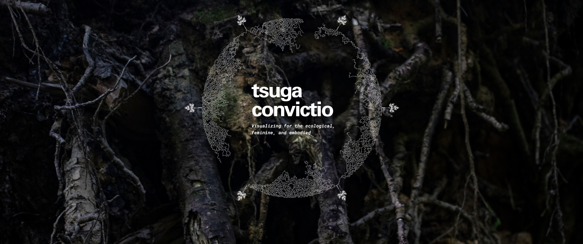
Image provided by Cathryn Ploehn © 2020
Selected as part of the IEEE VIS Arts Program (IEEE VISAP) this fall, the research project “Tsuga Convictio: Visualizing for the ecological, feminine, and embodied” was created by Cathryn Ploehn, Molly Steenson, and Daragh Bryne, of Carnegie Mellon University, as part of Ploehn’s Master’s thesis in Design for Interactions. The resulting project and paper are truly captivating and a outstanding representation of the sort of student thesis work that the SIGGRAPH 2021 Art Papers program is looking for.
To learn more about this project, we sat down with Ploehn. Keep reading for her insight on the work. Click here to watch Ploehn’s IEEE VIS 2020 session presentation.
SIGGRAPH: Share some background on “Tsuga Convictio.” What inspired the project?
Cathryn Ploehn (CP): “Tsuga Convictio” came out of a disconnect between my ethics and my well-worn methods for creating data visualizations. At the beginning of this project — reading a deluge of critique from scholars and artists such as Catherine D’Ignazio, Mimi Onuoha, Johanna Drucker, Jenny Odell, and others — a gulf between commonplace data visualization theories and practices (particularly aesthetics) and the need to reimagine what equitable and just visual representations meant became viscerally clear. Meanwhile, I began hosting community conversations in which the noticing of patterns of feeling were central for the belonging and healing of stressed students. An opening became legible. I wondered how my practices might change at the nexus of the two, interrogating data visualization (“data viz”) through a context of conversation that required a forefronting of the imperatives — situated, agency, decentralization — that were both made evident in data viz critiques and are necessary for these intimate conversations to flourish.
SIGGRAPH: Tell us about the process of developing the research behind this Master’s project. How many people were involved? How long did it take?
CP: It took about a year and a half to complete “Tsuga Convictio,” my Master’s thesis. I began pulling the thread that eventually became this project during an independent study in January 2019, advised by Molly Steenson (who went on to advise my Master’s thesis). At that time, I discovered the fecund challenge to data visualization that my nascent practice of holding vulnerable conversations with my master’s cohort offered.
Over the next year, working on the thesis became a process of wandering, collecting oddball ways to think through my well-worn data viz practices anew: what did data visualization even mean? Though, a Master’s thesis takes a village, and this work is no exception. Though the hands-on work of developing, designing, and writing was all me, I was in constant conversation with the community of my fellow Master’s students and professors at Carnegie Mellon as I waded through unfamiliar waters. These folks offered valuable signposts and sanity checks as I, again and again, attempted to articulate new theories about what data visualization could otherwise mean. The questions that drove my project kept it securely in a discursive space.
Beginning and ending with theories and principles, such as those offered in D’Ignazio and Klien’s “Data Feminism,” I framed my work as a research through design project, making prototypes to learn about what else data visualization could be. Beginning with those theoretical hunches, I worked to create an experimental data visualization, which in turn generated a map of interesting practices and even more theories. Using those, I worked to again prototype a data collection, which in turn generated more practices and theories. At each turn, I opened my eyes and ears to a wide range of scholars and work that resonated with the feelings key to my inquiry, rather than category — more often than not outside the realm of data visualization. The work became less about shiny deliverables and more about learning and conversations. I was left with a new sense of my place in the practice, and the experience of walking down new pathways as a data visualization designer that resonated with the values I hold.
SIGGRAPH: What was the biggest challenge you encountered while working on the research?
CP: This year in particular, we find ourselves in a moment of political reckoning and reflection of our everyday practices — in the field of design and beyond. The feeling of reckoning fractally manifested itself in my data visualization project, which was a response to recent (and old) charring, and necessary critique of data visualization practices common in the field. Shifting my own understanding of data viz into a new shape was necessary, but often discombobulating, even painful. The typical, comfortable moves I’d make in a normal project seemed untenable, and embarking onto unfamiliar ground was initially hard to advocate for as I sought the counsel of seasoned data visualization designers. Ultimately, the support of my advisors, Molly Steenson and Daragh Byrne, and peers proved to be a lifeline in feeling secure to explore and grow in those unfamiliar lands.
SIGGRAPH: “Tsuga Convictio” is rooted in data visualization, taking an ecological and feminist lens. What made the feminist perspective key to the work?
CP: Feminist (and antiracist) scholars — such as Johanna Drucker, Catherine D’Ignazio, Safiya Umoja Noble, Mimi Onuoha, Jenny Odell, and Donna Haraway — emphasize the politics of knowledge and observation as manifested in data. Their work often plays in the space of revealing and interrogating the situatedness and constructedness of data. Who gets to know about whom, and how? How do power and control emerge from those records (or lack thereof)? Where can agency and ambiguity make the world (and us) legible and categorizable (or less cleanly so)? Asking and answering these questions in the scope of my own project continually informed decisions as I worked, from the (re)claiming of the word data to the way in which I positioned myself in my own project. For me, working with a feminist perspective meant continually reflecting upon the situatedness of the data, and the relationships of power that subsequently unfurl from there, and articulating those qualities and keeping them malleable.
SIGGRAPH: During your VIS 2020 presentation, you drew parallels between your work and COVID-19 data visualizations. Can you expand on this for those who might have missed your talk?
CP: In my work, inspired by ontological design, I framed data visualization as a visual sensemaking tool. How data visualizations present the world to us — by design and aesthetics — set us up for certain kinds of relationships to those realities represented. At the time of this interview (mid-December 2020), we are losing more people to COVID-19 every day than we did during the 9/11 terror attacks. On 11 September 2001, we experienced the numbers of dead and dying through visceral and heart-wrenching video — through blood, dust, and shrapnel. Using these images, we were able to grieve and make meaning out of the immense pain.
In contrast, the realities of the sick and dying during our current pandemic are decentralized and often hidden away in lonesome hospital rooms. The aggregate of our losses, then, are often abstracted into lines and dots in the visualizations deployed by The New York Times or Johns Hopkins University. These aesthetics are useful, in the sense of practicality and safety. At the same time, it mainly affords us to make sense of this pandemic through a numbness and distance, an effect produced (in part) from framing and geometric abstraction, common in data visualization practices. Thus, the weight of the loss is harder for us to process and make meaning out of. Two visual sensemaking tools, video and data visualizations, produce two radically different relationships with the dead and dying. This moment of profound grief and loss — the dead and grieving deserve more than just a numbing analytical aesthetic.
In my work, I explored a few alternatives to data visualization practices of geomteric abstraction. I responded to the imperative to de-obscure the bodies in the data visualization aesthetics through the poetry of ecologically driven visualizations — aesthetics that maintain the sense that we are looking at complex and beautiful individuals. Further, I discovered practices of building data visualizations that forefront the feelings and relationships with the realities behind the numbers (as opposed to the efficiency of understanding relative amounts). “Tsuga Convictio” doesn’t offer a clean solution to how data visualizations should help us make sense of loss, but opens up a conversation of how we might mindfully begin to design for it. I am further exploring this question of visualizing the data of the passed in a project in partnership with the organization Gayta Science.
SIGGRAPH: For SIGGRAPH 2021, the Art Papers program is seeking student thesis works. What advice do you have for someone looking to submit art research to a conference?
CP: In my own short experiences in submitting work to various venues, finding and returning to the feeling of value in your work has been a central move. Sending off an abstract or proposal often felt like shooting a message into the void. In those moments of vulnerability and self doubt, I realized this discomfort is also a signal of the importance of the work to you; a healthy sign that you are perhaps working on the right things. In the face of the several rejections, before the work was ultimately accepted into IEEE VISAP, reminding myself of the value I see in this project (particularly for myself) has kept me grounded.
More pragmatically, I have often found focus in understanding the conversations my work is contributing to (and opening). For me, it started with understanding my niche; what kind of role I may play in particular design and data visualization communities. From that niche, it was easier to find the slice in my project — that had ever-unfolding multitudes to it, much like any project — to show to that venue. Focusing on that interesting conversation that may resonate with the SIGGRAPH community may be an invaluable north star in submitting work.
The SIGGRAPH 2021 Art Papers program is currently accepting both short and long papers across several categories, including student thesis work, through 15 January 2021.
Cathryn Ploehn (she/her) is an interaction designer and lecturer interested in embodied, feminist, and ecological modes of creating — and (re)enchanting — data visualizations. She holds an MDes from Carnegie Mellon University.


