Still from “Inside Hurricane Maria in 360 Degrees,” courtesy of NASA/GSFC Scientific Visualization Studio
In September 2017, Hurricane Maria devastated the Caribbean, notably Puerto Rico. The Category 5 hurricane caused more than 4,000 deaths and left Puerto Ricans without power for months. Using scientific data visualization, the visualizers at NASA/GSFC Scientific Visualization Studio journeyed inside Hurricane Maria for an experience that chronicles two days before the storm hit Puerto Rico, revealing the structures inside the hurricane that led to its intensification from a Category 3 to a Category 5 storm over a period of just 24 hours.
Greg Shirah (lead visualizer, NASA), Kel Elkins (visualizer, USRA/NASA), and Alex Kekesi (visualizer, GST/NASA) showcased “Inside Hurricane Maria in 360 Degrees” as part of the SIGGRAPH 2019 VR Theater. Originally released on 4 October 2018, this visualization took four months to create and is NASA Global Precipitation Measurement’s (GPM) most-watched video to date. Read on to learn more about how they visualized the hurricane and to watch the full experience.
Developing the Story
After running many tests with 3D precipitation data and holding meetings with scientists and media representatives, the visualization had about 150 iterations focused on camera path and speed and the “what, when, and where” representations of data. Before diving into “Hurricane Maria,” it is beneficial to understand the background on creating scientific data visualization.
When creating a scientific data visualization, NASA first “finds the story in the data” through the collaboration of data visualizers, scientists, and producers. Scientists provide an accurate representation of the data, data visualizers turn datasets into compelling visuals, and producers frame the story in a way that audiences can understand. Searching for interesting features, unexpected results, and personal connection — as well as understanding the story scientists are trying to tell — is the first step to mapping a story.
Breaking Down 360-degree Visualization
Context
To tell a story with complex scientific data, it’s important to provide context in setting the scene. Context is crucial for the viewer’s understanding, and it starts by showing where the data was collected. It is important to set the scene with imagery, terrain, and political boundaries. Next, introduce the data and include cues that help viewers interpret the data.
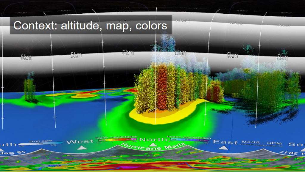
Context for this visualization is established using an Earth ground map, star field, altitude, map of the hurricane, and colored particles — along with the camera path cue of where the visualization is going and where it has already.
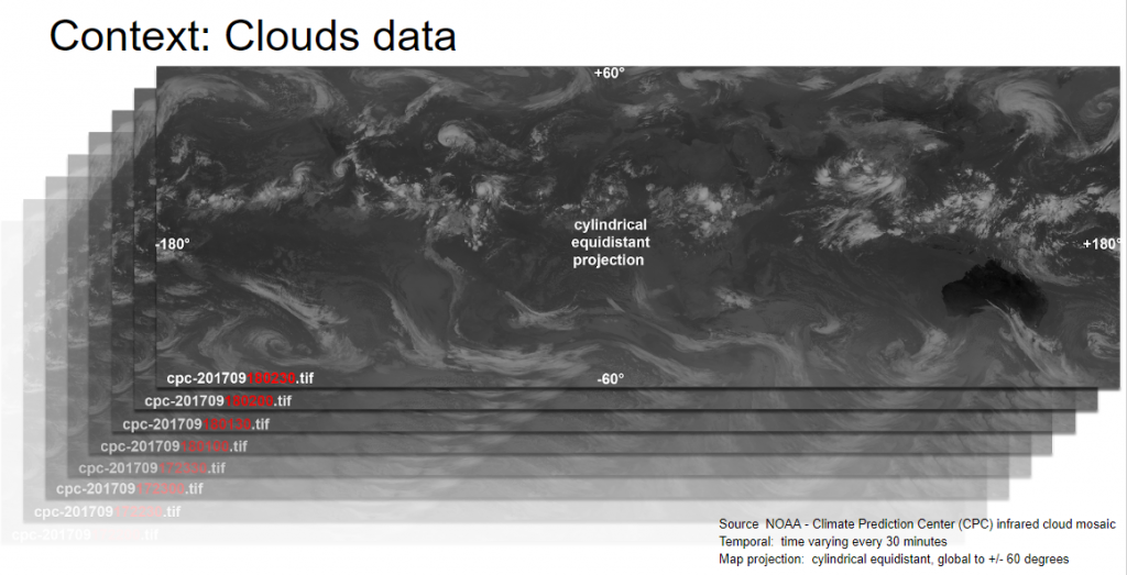
Because this particular visualization is about a hurricane, clouds are crucial to set the context of the story. Infrared cloud data are used since they show up in both day and night.
Date and Time
Scientific visualizations often include data from multiple dates and times, such as the cloud data of Hurricane Maria approaching Puerto Rico. However, visual effects (VFX) software doesn’t know about year, month, day, hour, minutes, seconds, or fractional seconds. Shirah shares that his team typically represents date and time using a Julian Date (JD) which is often used in astronomy. A JD represents the date and time as a double precision number. It is the number of days — including fractional days — since noon Universal Time (UT) on 1 January 4713 B.C. JD representations are robust and can handle different lengths of months, leap years, and leap seconds. JDs are keyframed in the animation, and a custom script called the dateMapper converts from JD to date/time every frame. This allows the visualizer to control the flow of time. JDs can also be easily compared, subtracted, and added.
Another set of custom scripts that runs every frame are fileMappers. These scripts use the information from the dateMapper to construct appropriate texture file names as needed. “Science data sets are long and messy,” Shirah says. “These are simple examples. We’ve learned from experience that keeping processed files, like floating point textures, close to the original names of the science data sets is much better than renaming or linking to files. Otherwise you can quickly lose track of which processed files correspond to which data files and have difficulty changing time rates.”
Data
Next, a ground precipitation sequence was added along with GPM Microwave Imager (GMI) data and 3D Rain Radar data. The GMI data collection is a single time step and includes ground-level precipitation rates, liquid and frozen precipitation, and a swath width of 904 kilometers. This 2D data set was used as the base level of the map, and it was saved to floating point texture.
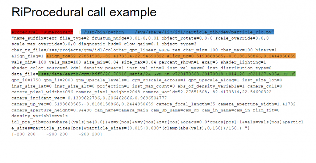
The 3D Rain Radar collection also is a single time step of volumetric liquid and frozen precipitation rates with a swath width of 245 kilometers. Every frame in a script builds RiProcedural RIB directive and uses keyframed particle sizes, colors, type, and instancing. At render time, the RenderMan software calls Interactive Data Language (IDL) via RiProcedural’s “RunProgram.” Then, IDL generates RIB based on parameters passed in, and RIB is sent back to RenderMan for rendering.
For example, the below capture shows a string constructed by Maya Embedded Language (MEL) that is an RiProcedural RIB call for a particular frame of the animation:
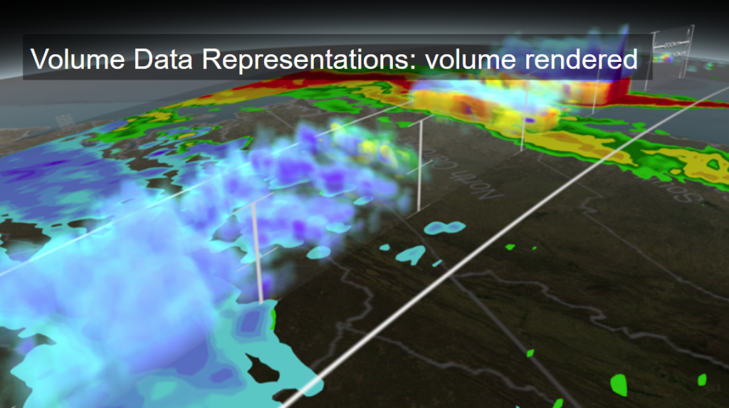
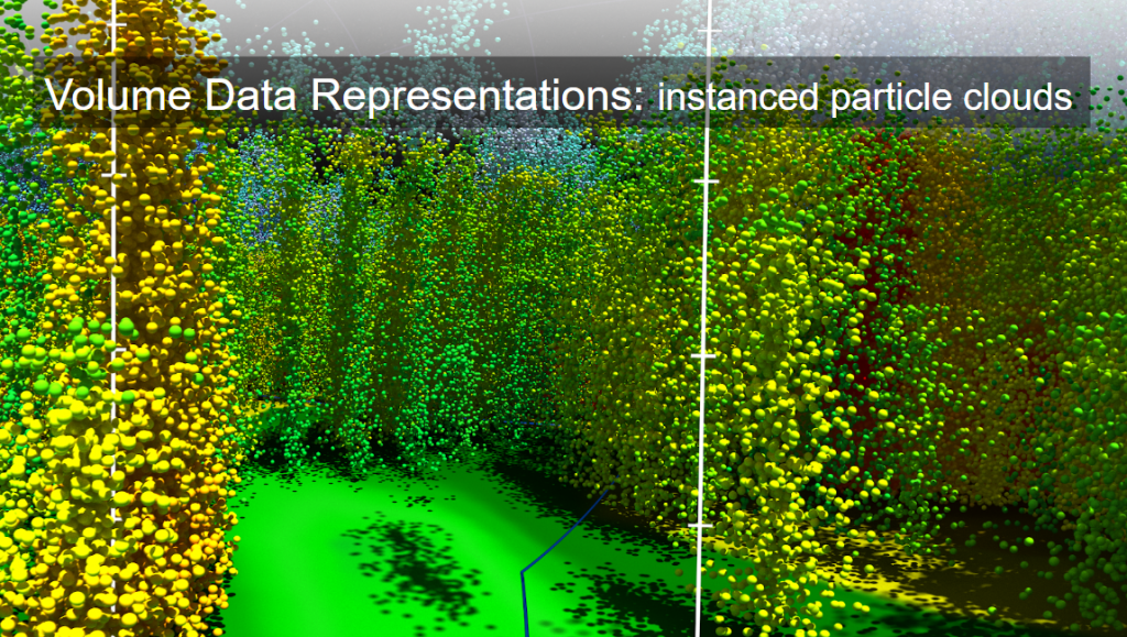
Volume Data Representations
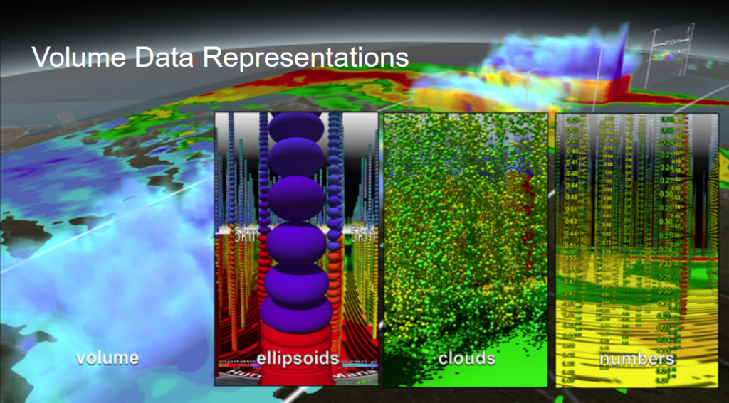
Shirah and his team chose particles to represent volumes instead of traditional volume rendering because particle rendering is much faster. Also, particles explicitly represent each individual voxel measurement, revealing the instrument’s data collection resolution and spacing.
Instanced Particle Clouds
The team used instanced particle clouds so that the value at each voxel creates a random distribution (with density driven by the voxel’s value) of particles within that voxel. For virtual reality (VR), the technique gives a discreteness to the hurricane’s structures while creating a feeling of flying between the rain bands.
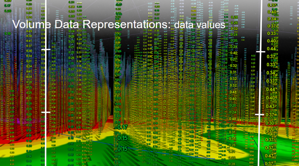
Data Values
The image below shows actual data values (in millimeters per hour) of rainfall from the science data set in their appropriate locations. Some values may be less at lower altitudes because of evaporation, high-speed winds moving precipitation horizontally, or updrafts.
This technique has several advantages, such as implicitly showing voxel size and spacing. Shirah notes that the center of each voxel is the decimal point of the value. The technique allowed the team to compare actual values to each other and quickly shift attention from values close to the camera to values farther away.
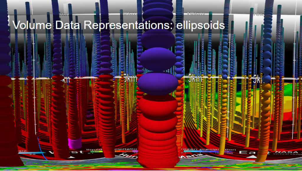
Ellipsoids
Ellipsoids are spheres where vertical scale is constant in that each sphere does not touch the one above or below it. The horizontal scales and the colors are driven by the precipitation value of the voxel.
In building “Inside Hurricane Maria,” the use of ellipsoids offered advantages similar to that of the data values in voxel size and spacing, comparing actual relative sizes, and shifting attention to values close to the camera and father away. The frame shown here is the “melting layer.”
The team faced several problems and learned a few lessons about creating 360 videos. Visualizers are used to controlling the camera position and view direction, but in a 360 video, the camera view direction is controlled by the user. For this reason, the narration script had to be constantly aware that the viewer may not be looking at the points of interest. The team handled this by using a combination of glyphs in the movie as well as narration cues. There was a longer turnaround time for tests since the frames were larger (4k x 2k low-quality renderings took a weekend, and 8k x 4k high-quality rendering took a month). Viewing the rendered results took longer, too, since the frames had to be warped for proper viewing. A GoPro Mac application was used for quick tests, and YouTube uploads were often used but took hours to upload and process. There were some rendering artifacts near the seams of the 360 view that were a constant problem. The data values mapped onto many small planes had to be individually oriented toward the camera for every frame.
Experience the techniques and storytelling in action by viewing the full experience below!
Experience a new wave of virtual reality content this summer through the SIGGRAPH 2020 VR Theater in Washington, D.C., 19–23 July. If you have a 2D scientific visualization that you think should be considered for the conference, submit it to the Computer Animation Festival Electronic Theater today!
 Greg Shirah has worked with computer graphics at NASA Goddard Space Flight Center in Greenbelt, Maryland, for over 35 years. Greg has made numerous contributions to SIGGRAPH over the years, including the Computer Animation Festival, Art Gallery, traveling art show, dailies, Panels, and special sessions. He is currently the lead visualizer at NASA’s Scientific Visualization Studio where he designs and develops data-driven scientific visualizations for NASA public outreach.
 Kel Elkins is a data visualizer with NASA’s Scientific Visualization Studio at the Goddard Space Flight Center in Greenbelt, Maryland. He works with scientists to visualize data from NASA missions, including both observational data (from satellites, aircraft, etc.) and supercomputer simulations. These visualizations promote a greater understanding of Earth and Space Science research activities at NASA. Prior to joining NASA, Kel worked at an aerospace software company where he specialized in communicating complex technical concepts related to spacecraft and aircraft mission planning. Kel holds a Master’s degree in Computer Science and Game Technology from the University of Pennsylvania and a Bachelor’s degree in Aerospace Engineering from Penn State.
 Alex Kekesi is a principal visualization programmer at NASA’s Goddard Space Flight Center.