Image credit: photo by Andreas Psaltis © 2024 ACM SIGGRAPH
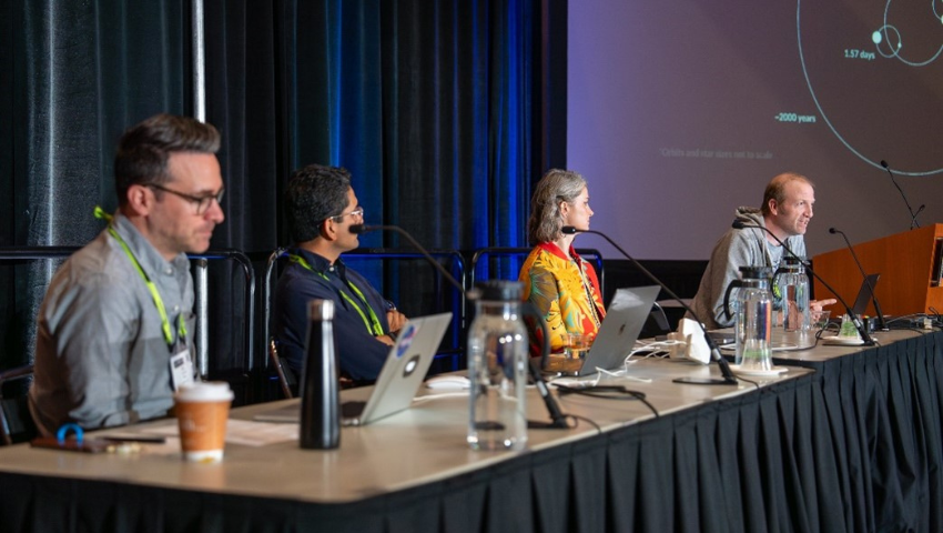
Catch up with the team behind the SIGGRAPH 2024 Panel “Visualization and the Science/Art of Making the Complex Simple”. Hear why this topic is important and this team was inspired.
SIGGRAPH: Tell us about the inspiration behind your Panel, “Visualization and the Science/Art of Making the Complex Simple”. Why was this an important topic to share at SIGGRAPH 2024?
Karthik Patanjali (KP): In a previous edition of SIGGRAPH, I encountered the works of Kalina and Kel. Despite working in different fields, I was fascinated by the many similarities and subtle differences in our approach to visualization. Furthermore, Lars’s medical background and engaging style in panel discussions inspired me to initiate this panel and to hopefully to start a conversation with the SIGGRAPH community about a topic we find captivating.
Kels Elkins (KE): Science data visualization may not be as flashy as video games, special effects, or animated movies, but we believe visualization has an important role in the computer graphics community. SIGGRAPH is a great opportunity to bring together like-minded students and professionals, so it is beneficial to have SIGGRAPH sessions dedicated to visualization topics to both inspire younger professionals to explore the field, and for established visualizers to meet and discuss techniques and common challenges.
SIGGRAPH: Dr. Riedemann, tell us more about your background as a consulting neurologist. What first interested you in the healthcare AI space? How can visualization make complexities in healthcare more “simple”?
Lars Riedmann (LR): Over a decade ago, during my postdoctoral training at Harvard Medical School and MIT, I became deeply interested in applying artificial intelligence to healthcare. Early AI systems equipped us with the tools necessary to analyze extensive 3D imaging datasets, including nanoparticles captured through multiphoton microscopy, as well as MRI, CT, and OFDI images. A comprehensive image analysis led to groundbreaking discoveries of new disease patterns and provided valuable insights into the microenvironment of brain tumors.
By leveraging advanced imaging techniques, we and others have significantly enhanced our ability to visualize and understand the intricate biological processes within tumor tissues at a granular level. Crucially, visualization technologies have transformed complex clinical and research data into clear, accessible visual formats. This transformation aids researchers, clinicians, and patients in deepening their spatial understanding of brain tumors and their clinical implications.
Furthermore, AI-powered tools such as virtual reality and augmented reality offer immersive learning experiences for researchers, medical professionals, and students. These spatial computing technologies render complex scientific and medical concepts more tangible and practical, thereby advancing both research and clinical practice.
SIGGRAPH: Kel, tell us about your time working at NASA, and how it inspired your portion of this panel. Is there a specific NASA project using visualization that you are most proud of?
KE: I’ve been with the NASA Scientific Visualization Studio (SVS) for about ten years now. We collaborate with scientists working on a wide range of science topics at NASA – one week I could be working on an Earth Science climate change visualization, and the next week I’m visualizing the path of a satellite on its way to study a distant moon or asteroid. Some of the topics we cover in our studio are highly complex, and effectively communicating NASA’s groundbreaking work to the public is one of those challenges that make this data visualization work interesting and rewarding.
I am particularly proud of the visualization work I did for NASA’s OSIRIS-REx mission, which involved sending a satellite to study the asteroid Bennu and take a sample of the surface to return to Earth. Two visualizations I made for this mission were selected for the SIGGRAPH Computer Animation Festival (“Tour of Asteroid Bennu” 2021, and “Web Around Asteroid Bennu” 2022).
SIGGRAPH: Kalina, you are a cinematic scientific visualization pro, and you’ve incorporated sci viz into several SIGGRAPH presentations, including this one. From your work at NCSA, what innovation in visualization are you most proud of, and how has it helped “make the complex simple”?
Kalina Borkiewicz (KB): Cinematic scientific visualization is all about making the complex simple, almost by definition – it’s a way of presenting scientific data to people of all ages via films and museums, and the target audience often includes young kids. So the visualization needs to (1) be easy to understand, (2) be as accurate as possible, and (3) look great. One video that I’m really proud of is a visualization of the process of photosynthesis in an organelle (https://mediaspace.illinois.edu/media/t/1_12y7kuog). It’s quite the complex process because things are happening all over the place, at different physical scales and time scales simultaneously. For example, parts of the process involve light and so occur at the speed of light, while others, being biological processes, are trillions of times slower. There’s a similar problem around elements of vastly different sizes interacting with one another. On top of all that, there is a layer of quantum physics and the wave-particle duality of photons… imagine trying to explain that to an eight-year-old! In the end, after many drafts and iterations, and even more conversations with scientist experts, we managed to strike a balance between accuracy and accessibility. We visualized some aspects with high fidelity and others more abstractly, focusing the key elements of the photosynthesis narrative – quantum physics was an unnecessary side-story. It took a lot of work, but I’m really proud of the final visualization, which went on to win several awards. You can read more about this particular visualization here: https://doi.org/10.1016/j.parco.2020.102698
SIGGRAPH: Karthik, tell us about your article in the New York Times titled ” See How the Dixie Fire Created Its Own Weather”. What type of visualization processes did you make this project into something simple that the everyday person can understand? How did those processes inspire your Panel ““Visualization and the Science/Art of Making the Complex Simple”?
KP: The Dixie Fire piece is a 3D reconstruction that uses data to illustrate how the fire grew and produced its own weather patterns. It’s designed to be accessible to a broad audience, combining different types of data into a simplified visualization. Creating this visualization required a lot of iteration to strike a balance between showing all the data and ensuring it’s easy to understand.
SIGGRAPH: What key takeaway from your Panel do you hope SIGGRAPH 2024 attendees are reflecting on a month past the conference?
KE: Data visualization can help people understand complex science and technical concepts, and that it can be extremely rewarding to develop visualizations that are both easy to understand and aesthetically pleasing.
KB: The high-level takeaway is that data visualization is an exciting subfield of computer graphics – one that many SIGGRAPH attendees might not have fully explored. When I was an undergraduate studying computer graphics, I wrongly believed the field was split into just two paths: (A) film and (B) games. That seemed like the extent of where a graphics specialization could take you. But then I stumbled upon data visualization, and it completely transformed my perspective. It opened up a whole new realm of creative possibilities, and I’ve been hooked ever since. Perhaps this panel served as a similar revelation for some attendees.
On a deeper level, I want people to walk away understanding that data visualization isn’t just about translating numbers into charts, it’s an art form. It’s not a simple, factual reflection of reality but a way of interpreting and communicating information. While data=truth in many minds, there’s no singular “right” way to create a visualization. Each of us on the panel had distinct styles, techniques, and philosophies around visualization. This subjectivity makes visual literacy crucial, not just for the creators, but also for the consumers of these visual stories.
SIGGRAPH: What advice would you give to one who plans to present a Panel at a future SIGGRAPH conference?
KE: I’ve found that my favorite panels at SIGGRAPH tend to include a range of perspectives, ideally including people from different organizations. A panel isn’t just an opportunity to present your work (which attendees may have already seen) – a panel is a discussion to compare and contrast pipelines, goals, and motivations. Some of the best panels I’ve attended at SIGGRAPH include panelists who may disagree, or take different approaches to the same work. In our work, we (Kalina, Karthik, Lars, and I) all have very different methods in how we approach data visualization, but discussing our differences gives us the opportunity to learn from each other.
KB: The key to a successful panel is bringing together people with diverse backgrounds and perspectives. You want a dynamic conversation, not a group of people who all agree with each other. Disagreement, when constructive, adds depth to the discussion and brings out a range of ideas.
For example, one area where my fellow panelists and I disagreed was on how to handle data artifacts (errors) in visualizations. Kel emphasized the importance of staying true to the data and preserving artifacts, as they offer an opportunity to explain the data collection process to the audience. I completely respect that viewpoint, especially for an organization like NASA, where transparency and accuracy are critical. However, my approach has been different, especially when working on visualizations for large-scale immersive environments like dome theaters or IMAX screens, where the aim is often “edu-tainment” rather than data analysis. A 20-foot artifact flickering on a giant screen can be more than a distraction, it can even be a jump scare, potentially ruining the experience for younger viewers who might not understand the reason behind it. I remove or hide data artifacts whenever possible. My focus is on inspiring curiosity and excitement about science, whereas Kel and Karthik are more focused on conveying information, which is why our approaches to data artifacts (and visualization) differ.
For future panelists, I’d recommend embracing these kinds of differences. A good panel thrives on a variety of opinions and approaches, so don’t shy away from disagreements; they’ll make the conversation richer and more engaging for your audience.
Submissions for SIGGRAPH 2025 Panels will be opening later this year! Bookmark the Panels program page so you don’t miss your opportunity to submit.

Kel Elkins is a data visualizer with NASA’s Scientific Visualization Studio at the Goddard Space Flight Center in Greenbelt, MD. He works with scientists to visualize data from NASA missions, including both observational data (from satellites, aircraft, etc.) and supercomputer simulations. These visualizations promote a greater understanding of Earth and Space Science research activities at NASA. Prior to joining NASA, Kel worked at an aerospace software company where he specialized in communicating complex technical concepts related to spacecraft and aircraft mission planning. Kel holds a Master’s degree in Computer Science and Game Technology from the University of Pennsylvania and a Bachelor’s degree in Aerospace Engineering from Penn State.

Kalina Borkiewicz uses computer graphics for data storytelling. She spent the last 10 years working at the National Center for Supercomputing Applications (NCSA), where until recently, she was the Director of the Visualization Program Office and the Director of the Advanced Visualization Lab (AVL). The AVL is an award-winning team that creates cinematic scientific visualizations for films, museums, television, IMAX, and immersive domed theaters. Kalina has contributed to several films including “A Beautiful Planet”, “Seeing the Beginning of Time”, and “Birth of Planet Earth”. Aside from films, Kalina has also created graphics and visualizations for The New York Times as well as for live performances and concerts. This year, Kalina left NCSA to return to school and she is now a PhD student researching graphics and visualization at the University of Utah.

Karthik Patanjali is a Special Projects Editor at The New York Times. He shapes how journalistic stories are told using new and emerging technologies including AR/VR, 3D on the web, computer vision, machine learning and other computational approaches. His work has won multiple awards including an Emmy Award, multiple Online Journalism Awards, SNDs and Malofiej.

Dr. Lars Riedemann, MD, is a Consulting Neurologist and Digital Clinician Scientist, trained in Clinical Neurology and Biomedical Engineering at the University Hospital Heidelberg, Harvard Medical School, and the Massachusetts Institute of Technology. He is also a Autodidactic AI Engineer, Medical Community Builder, and Innovation Architect working at the Intersection of Healthcare, Artificial Intelligence, and Immersive Technologies.
