“Klaus” © 2019 Netflix
Last month, Netflix released “Klaus,” a holiday-themed hit and the company’s first original animated feature. The film captivated audiences with it’s non-traditional 2D animation, brought to life by texturing, volumetric lighting, and carefully crafted handmade work. We sat down with Szymon Biernacki and Marcin Jakubowski, two of the film’s production designers, to hear more about the technique and strategy behind this groundbreaking work, as well as how they utilized the diversity of their creators in production.
SIGGRAPH: Creating a feature film requires a great deal of collaboration. How many total Netflix employees actually worked on the film, and what was your role in bringing the film to life?
Marcin Jakubowski (MJ): The SPA Studios, the production company responsible for the film, is an independent animation studio, which was entirely financed by Netflix for this production.
Szymon and I were just two humble production designers among an impressive team of over 270 people from 22 countries working under one roof. At the same time, there were some freelance animators and external studios helping with clean-up and ink and paint. The 2D character texturing was done by Les Films Du Poisson Rouge in France. The credit list is quite impressive!
Szymon Biernacki (SB): As production designers, our role is to establish the look of the movie in a way that would help Sergio Pablos, the director of “Klaus,” tell his story, as well as make sure that all the departments follow his vision throughout the production.
SIGGRAPH: Can you share the shot or scene in “Klaus” that you are most proud of?
MJ: We really love the scene that begins with Klaus chopping wood during a sunset. A mysterious wind takes him to the workshop where he finds Jesper giving his Christmas pitch. It’s there that we reveal Klaus’ pain and anger.
At first, it was difficult to define what kind of emotions and moods to convey. We also had to find a visual language for a very broad range of emotions. [The feelings of] mystery, nostalgia, hope, disappointment, annoyance, pain, and grief all needed proper representation through color, light, composition, shape, motion, etc. It was challenging to fit all of those emotions into an environment that was designed long before the sequence was story-boarded. On top of that, we struggled to find the exact lighting setups that could carry the mood. Despite these hurdles, all of our efforts were rewarded … we ended up with one of the most spectacular sequences in the movie.
As production designers, we had the additional role of ensuring that the visuals followed the narration precisely. First, we had to figure out what we wanted the audience to get from a sequence and how to embed it into the pictures. We worked closely with every artist involved with each sequence, making sure that they understood the tone and the meaning of the scene. During production, each sequence goes through many hands, so it takes some effort to maintain the clarity. The final effect is a synergy of many artists’ inputs.
SIGGRAPH: Director Sergio Pablos has mentioned his vision was to have the film look like visuals you would find in an art book. What were your initial thoughts on this? Have you worked on similar visuals in the past?
MJ: We were ecstatic when Sergio asked us to explore this illustration-like approach. It’s a dream come true for a visual development artist. The stylistic choices, graphic designs, and paintings could be transferred almost directly onto the screen. The fact that it was actually the first feature production for both Szymon and me meant that we were not limited by typical production pipeline constraints. We dared to make things exactly as we wanted because we didn’t know the norms and what we shouldn’t ask for! We also had Sergio’s full trust, which was very encouraging. The 2D backgrounds had a handcrafted quality by default, and 3D scenes utilizing projected pictures painted by a background artist was an obvious choice; however, we still had to figure out how to impose an illustrator approach onto 3D props, and 3D and 2D lighting and compositing. We were very excited to see how far we could go with this approach.
SB: The biggest challenge was figuring out the look of the characters. When Sergio pitched the idea of putting volumetric lighting on top of 2D animated characters, my initial reaction was “Great! But how on earth do we do this?!” As far as we knew, this kind of look had not yet been applied in a full-length, traditionally animated feature film, so the challenge was huge.
There have been many attempts to make 3D animated characters look more 2D, but we knew we didn’t want to rely on shaders and any kind of procedural treatment to achieve what we were going for. Marcin felt strongly from the very beginning that “if it is supposed to feel like it’s handmade, then it should BE handmade.” He didn’t want to have any technological barrier between the artist and his work — no pressing of a “render” button and then waiting to see the result of the work. He wanted for the artists to see exactly what they were doing as they were working on the shot, very much as if they were painting in Photoshop. The difference was that they would later animate the layers they created to follow the animation of the characters. At some point, Marcin disappeared to his office and came back two weeks later with a test showcasing a prototype of the approach and the pipeline that we ended up using in the production. It was extremely impressive and almost suspiciously simple!
SIGGRAPH: Though the plot itself is rooted in reality, the detail in “Klaus,” much like the holiday season, is magical — the fluidity of movement and textured appearance, not to mention facial expressions realistic enough to achieve the comedic delivery of a real-life actor. How did you achieve this through 2D animation? How did you capture this among characters vs. the Smeerensburg scenery? What kind of technology was needed?
MJ: That’s the charm of a hand-drawn animation — it has the full potential to make the experience immersive and convincing. This medium includes all the storytelling devices that filmmakers need. Especially now with the new 2D-lighting and texturing tools we’ve developed, it’s easier than ever to convey mood in a very precise way. We’ve introduced the techniques not only to refresh the look of hand-drawn animation, but also to make the whole world integrated and believable. With 2D, it’s easier to go to extremes without making things inconsistent. That’s why these grotesque people of Smeerensburg naturally fit this weird town and then it’s easy to turn it into a charming and magical place.
SB: It also depends very much on the design choices. You have to adjust your visual language to support the tone of the story and give the artists enough of a realistic and believable world so that they’re able to evoke those believable emotions with the acting choices and environments they create. The first designs for the movie were actually more simplified and graphic, but when we realized that the story has such a deep heart, we made the world a bit more realistic and serious to help carry those real emotions. So we looked for this additional texture in the details of both the world and the characters. We needed something that would ground them more in reality and give our artists more range to play with. The animators did a fantastic job under the leadership of Sergio Pablos in terms of acting and conveying those subtle emotions through carefully crafted body language! The stylization of the shapes and designs gives the world of “Klaus” that magical feeling, but the emotional response that the movie elicits is delivered through believable acting of the characters and the “real” feeling of lighting and powerful moods that we were able to create … thanks to the character-lighting system we developed.
SIGGRAPH: What is the production timeline on creating such designs?
SB: It’s a bit hard to say exactly how much time we had to design the world and the characters in “Klaus.” We first started with some serious design work in 2014. We had a few months to come up with the foundation of the visual language for the world, as well as with the character-lighting technique, and then a few months to produce the short proof-of-concept/teaser. That gave us some time to develop our ideas without having all the pressure of an actual film production schedule. Then, we spent a couple of years looking for the funding of the actual movie, which gave us some extra time to digest things and think about “Klaus” a bit more, while we were working on other projects. I think, once the pre-production phase actually started, we were quite well-prepared to jump right into it. At that point, it was more about finding the right designs to support the story; however, we already had a very strong philosophy for the visuals established. I am not saying it was easy, we actually had a pretty tight schedule — around one year — and a relatively small design team, which consisted of three to four environment designers working at a time, and one character designer to design all of the characters. We didn’t even have the time to prepare proper production-design packages for the environments.
We didn’t hit any major roadblocks, but some designs took more time to nail down than the others. The design of Klaus himself, for instance. Our Character Designer Torsten Schrank went through countless iterations of the design until he found that “look in his eyes” that Sergio was looking for.
SIGGRAPH: What was the most unpredictable effect that technology (old or new) had on “Klaus”?
MJ: The 2D character lighting was definitely the biggest unknown, which had a huge impact on both the pipeline and look of the movie. It turned out to be the biggest surprise because the process itself was faster and easier than we expected, and the results were stunning! In the end, we managed to keep the consistency in the quality, which is quite a feat since it relied entirely on the artist’s skills. Implementing the lighting phase into the pipeline also was not easy because we had to organize the workflow around it, which wasn’t tested before production. The need for visual integration of all the elements on the screen also forced us to treat 3D rendering and compositing quite different compared to typical production.
SIGGRAPH: Put simply, what excites you about this work? Where do you find your inspiration?
MJ: I love the process of giving an abstract idea a clear form that inspires other people to spend their energy and creativity producing such a monumental piece of work. I also simply like painting and focusing entirely on a single task.
SIGGRAPH: We love how global and diverse the creators and crew for this film are. Was that important to the storytelling?
SB: Having a diverse team definitely makes you look at things from a variety of different points of view. We all come from different places and have different experiences and sensibilities. For instance, one of our concept artists is from Norway, so for him, designing the world of “Klaus” was very much based on reaching into his personal experiences of the landscapes and the weather from his homeland. For example, I remember one time discussing with him some pieces of concept art depicting a forest; he said that he responded to one of them specifically because it really FELT like his memories of winter afternoons in Norway.
This idea of creating a feeling over a realistic description was really important to us. So diversity played a big role in terms of keeping us all in check in producing a movie that would resonate with everyone, no matter where you come from.
 Szymon Biernacki is a visual development artist and art director working on feature animated movies. He was born in 1985 in Warsaw, Poland, where he grew up and studied architecture until he decided to quit university and become a full-time concept artist and illustrator. He started working on animated commercials, cinematics for games (such as “Age of Empires” online), and animated series (such as “Halo 4: Spartan Ops”) before joining The SPA Studios in 2013 to work as a visual development artist on his first feature animated movie, “Smallfoot” (Warner Bros.). During his time at The SPA Studios he has worked on many projects as a visual development artist, as well as helped Sergio Pablos develop original ideas for feature animated movies. But, the definite highlight is his role as the production designer — along with his friend Marcin Jakubowski — on “Klaus” (Netflix), directed by Sergio Pablos.
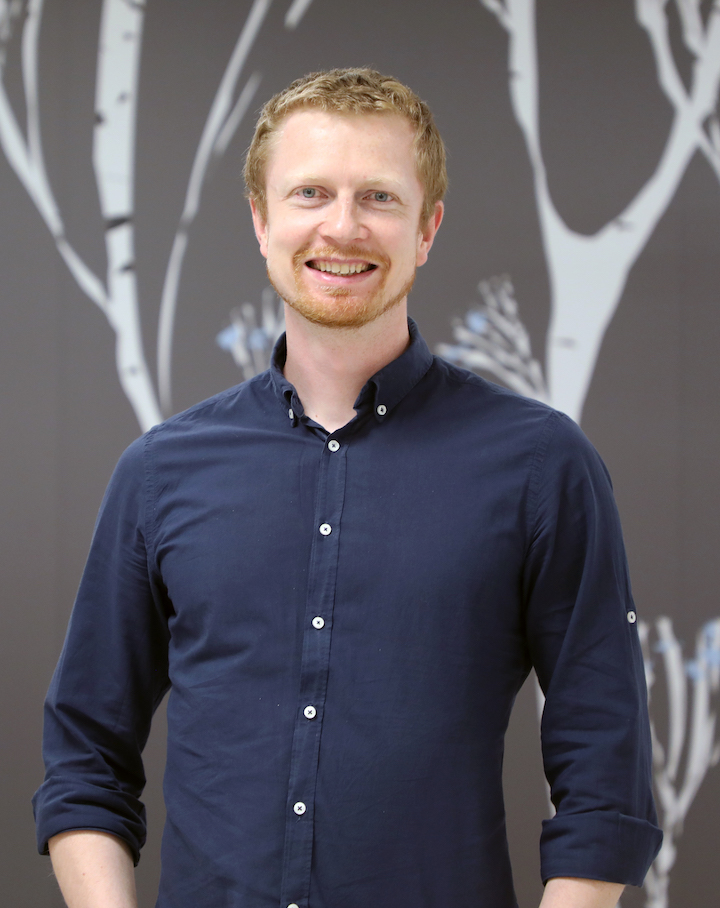 Marcin Jakubowski is a visual development artist who worked most recently as a production designer on “Klaus” at The SPA Studios. He introduced the 2D character lighting system that gives “Klaus” its unique look. As a self-taught, digital painter he had to make his way up to feature animation through web design, educational illustration, and TV commercials. Over the last few years, he has been involved in several story developments and he enjoys equally designing and contributing to story.